Company
Cycling Guide Foundation
Project Overview
Cycling Guide is a mobile navigation app for people with different cycling experiences. In this project, I was tasked to design a functionality allowing commuting cyclists to modify their journey’s starting or end point.
Project Type
Work Project
Role
UX Designer
Skills Demonstrated
Mobile App Design, Interaction Design, Form Design
Problems
There are two problems that I had to solve for this task.
- How might we come up with a workflow that can be done after a cyclists finds a destination
- How might we integrate an editing functionality seamlessly when a user is exploring cycling routes
Outcome
I was able to create a workflow that would allow users to make modifications to either their starting and end points seamlessly from the previous screen in a way that was intuitive to users.
Process
Early Concepts
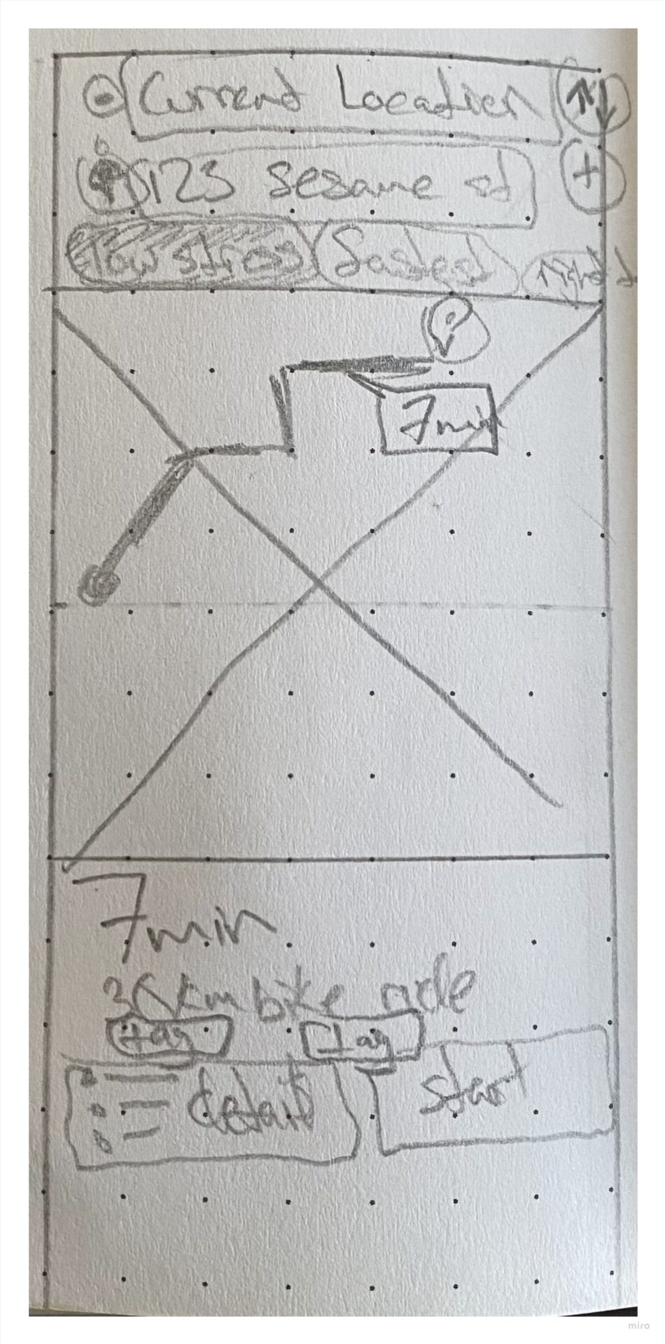
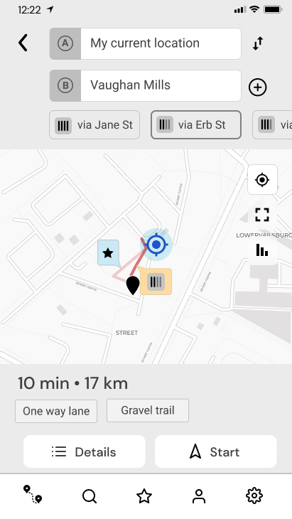
When starting this task, I designed an editing form panel on the screen while having the presented route options and the bottom drawer all on one screen.
During design critiques with my team, I received feedback that including an editing panel already on screen made the screen overall heavy and that we were losing valuable real estate for the map itself, which is important for the navigation app (of course)!
Continued Design Iterations
After a couple more sessions of design critiques, usability testing, and design iterations, the design was approved and ready to be delivered to the development team.
Usability Testing
I conducted usability testing on this screen to answer the following research questions:
- Can users get a route to a location through different workflows?
- Can users change their starting point of a route?
Insights from study
Most participants’ instincts were able to make changes to their journey and understand which input fields represented the starting point, end point and their current location.
Design Solutions
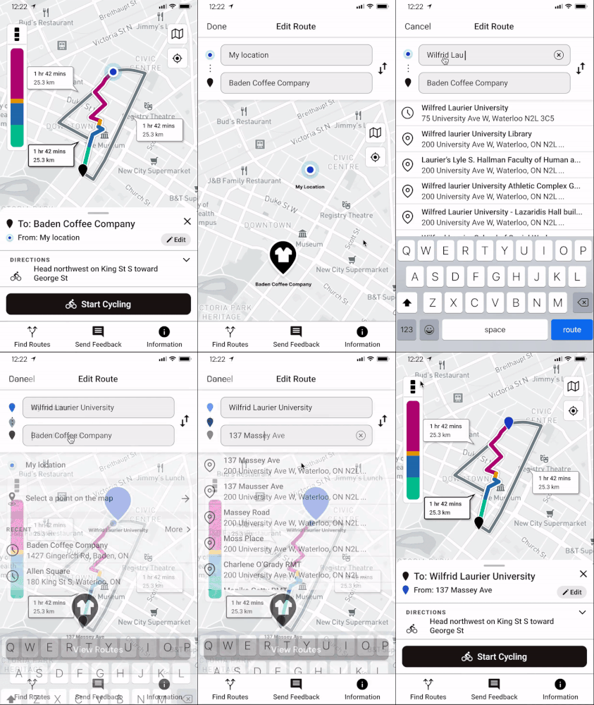
Chef-kissing-Iterating Design Details
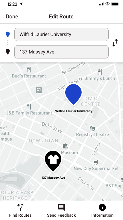
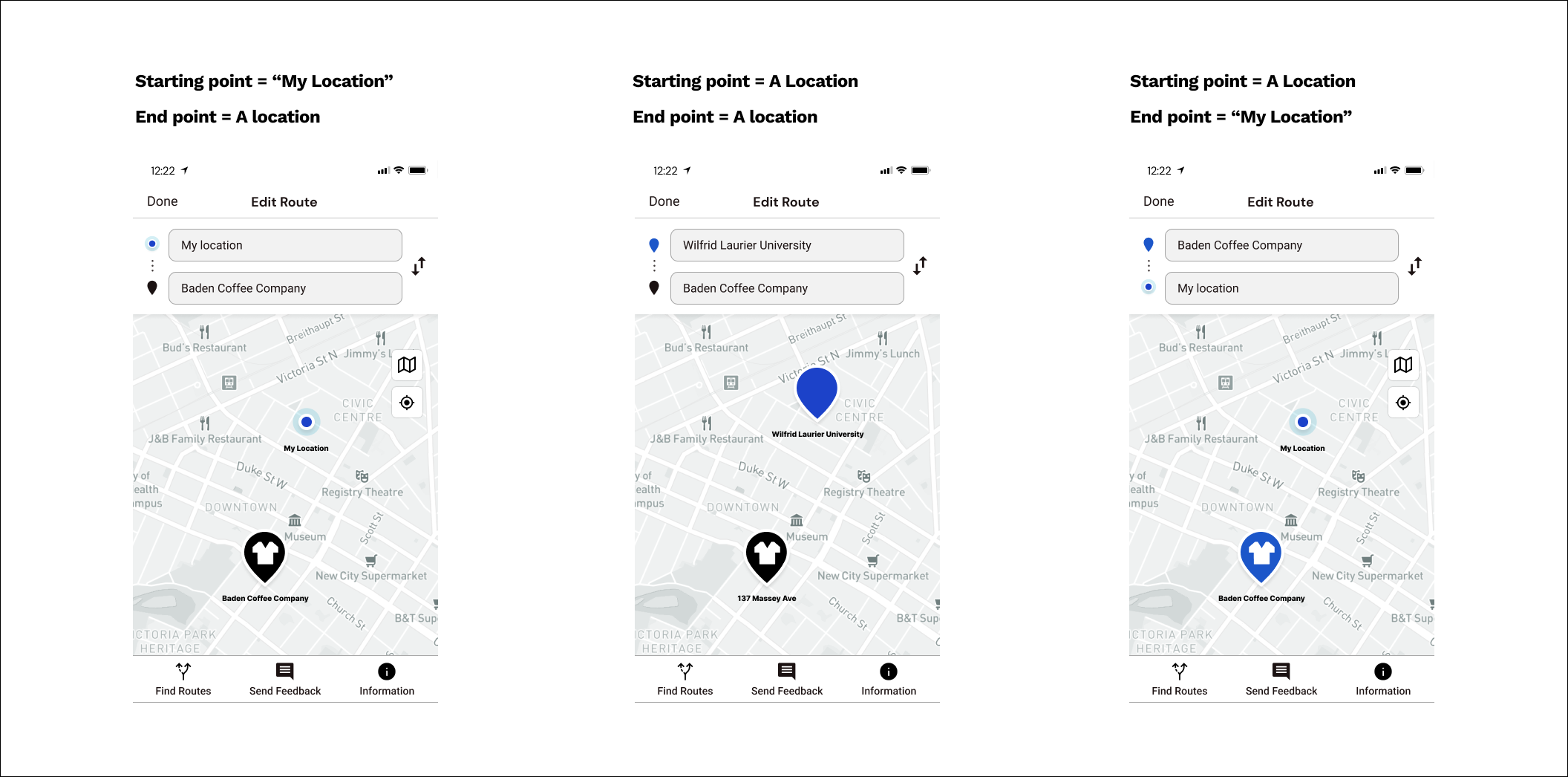
Although forms look easy to understand at a glance, label icons and interaction design help communicate a user’s action feedback and what the summary of a journey is. Below are some mockups that illustrate these scenario journeys.
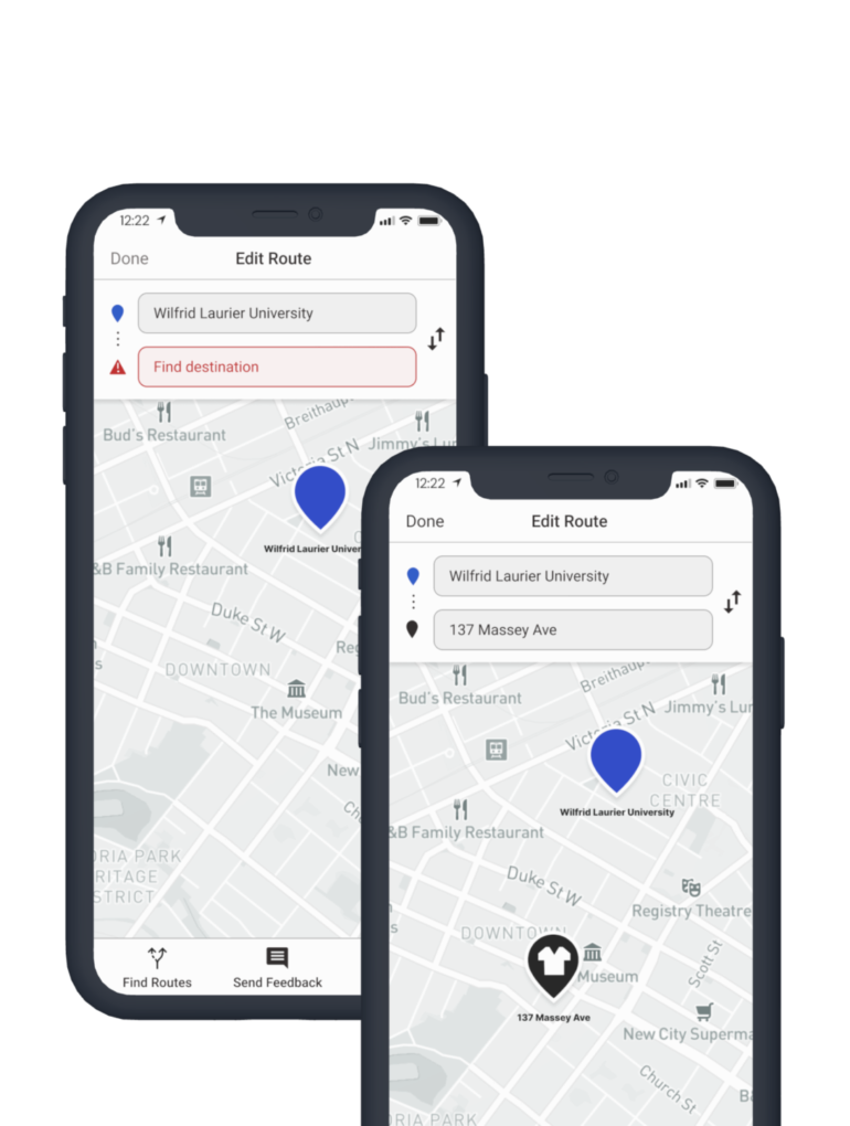
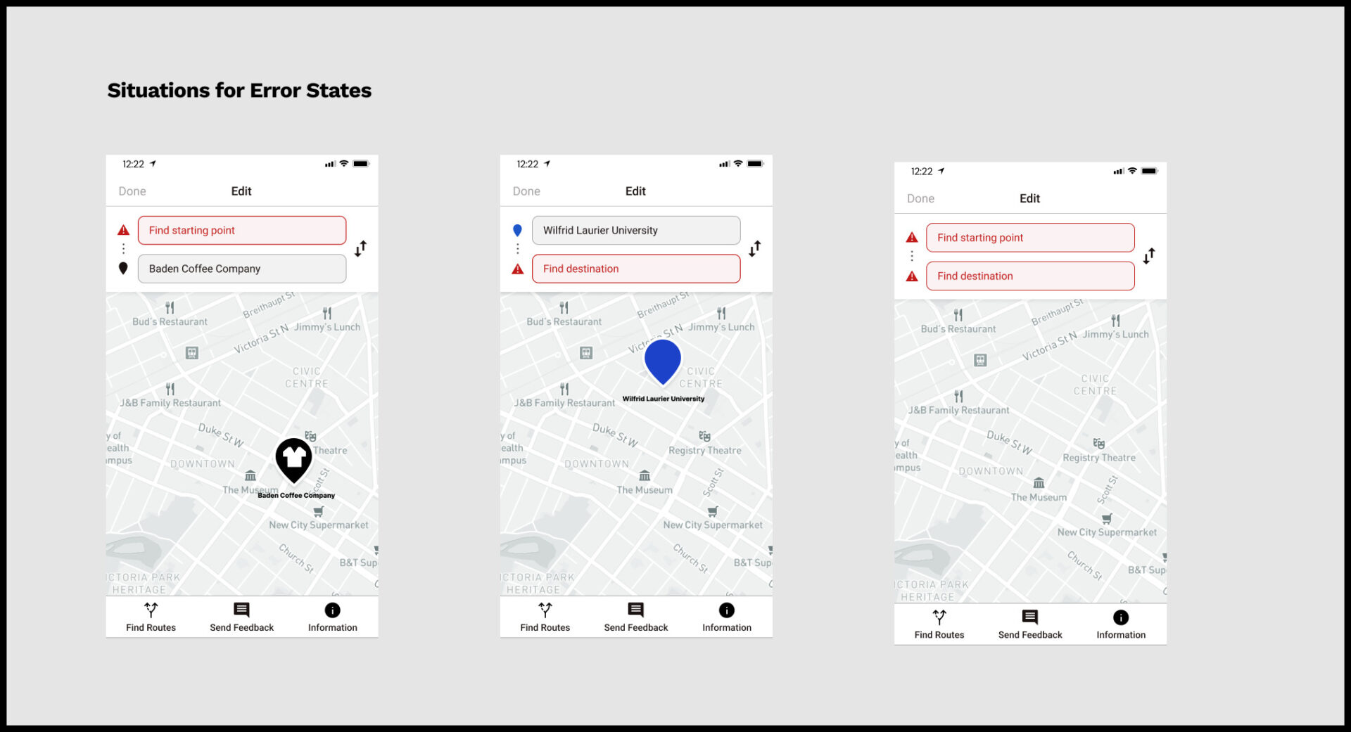
Resolving Address Field Errors
The error(s) that will occur when users modify their journey is when they leave a field blank. My approach to error messaging was to add another purpose to the label icon and the address fields’ placeholder text to communicate to the user what the error is and how to resolve it.
Handoff for Development
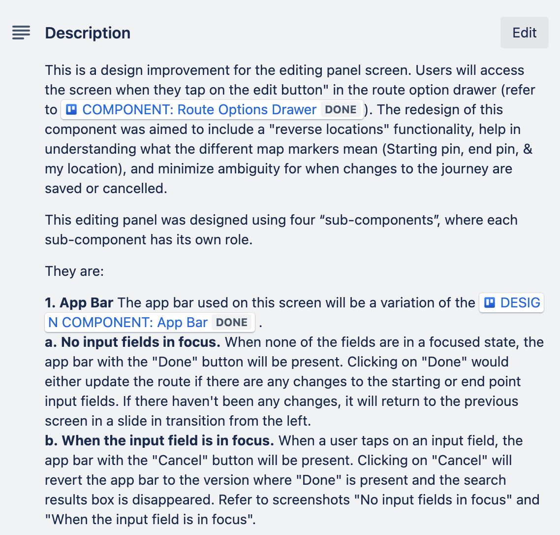
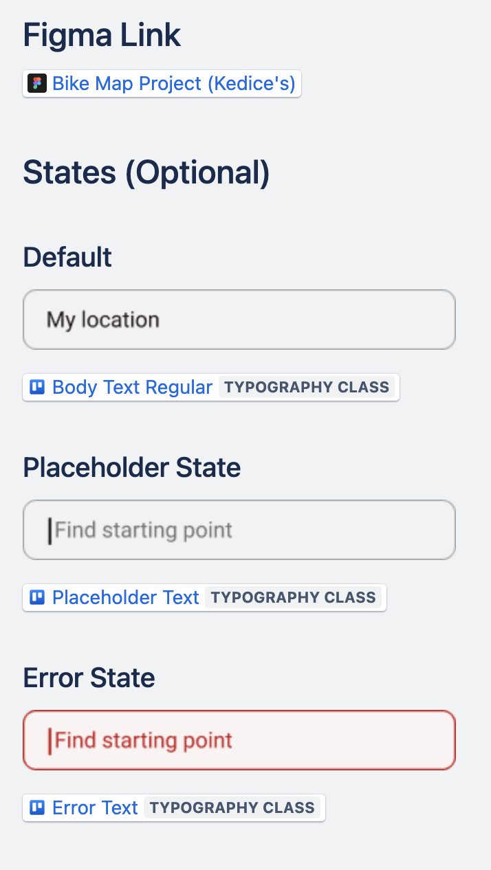
When I was at Zeitspace, as a part of my handoff packaging, I would write user stories related to the feature or epic that document details of the feature, acceptance criteria, and annotations of the screen. I also managed the design system for the project, which was organized in Trello.
Sample of User Story Ticket
Sample of Documentation for Design System
What I’ve Learned
For this design task, I used various usability testing sessions to help improve the transition from observing routes on the app screen to making modifications. From that experience, I continued to learn the value of user testing and how design solutions can be provided from the end user’s perspective. Since the design components associated with the editing panel were designed by myself, I was to ideate another purpose of the design components, such as using the label icon as a visual cue for errors like the placeholder text in the address fields. To summarize the lesson from that experience is that, as a designer, we don’t need to reinvent the wheel every time. Sometimes, the opportunity for a solution already exists in your work.
