Company
Cycling Guide Foundation
Project Overview
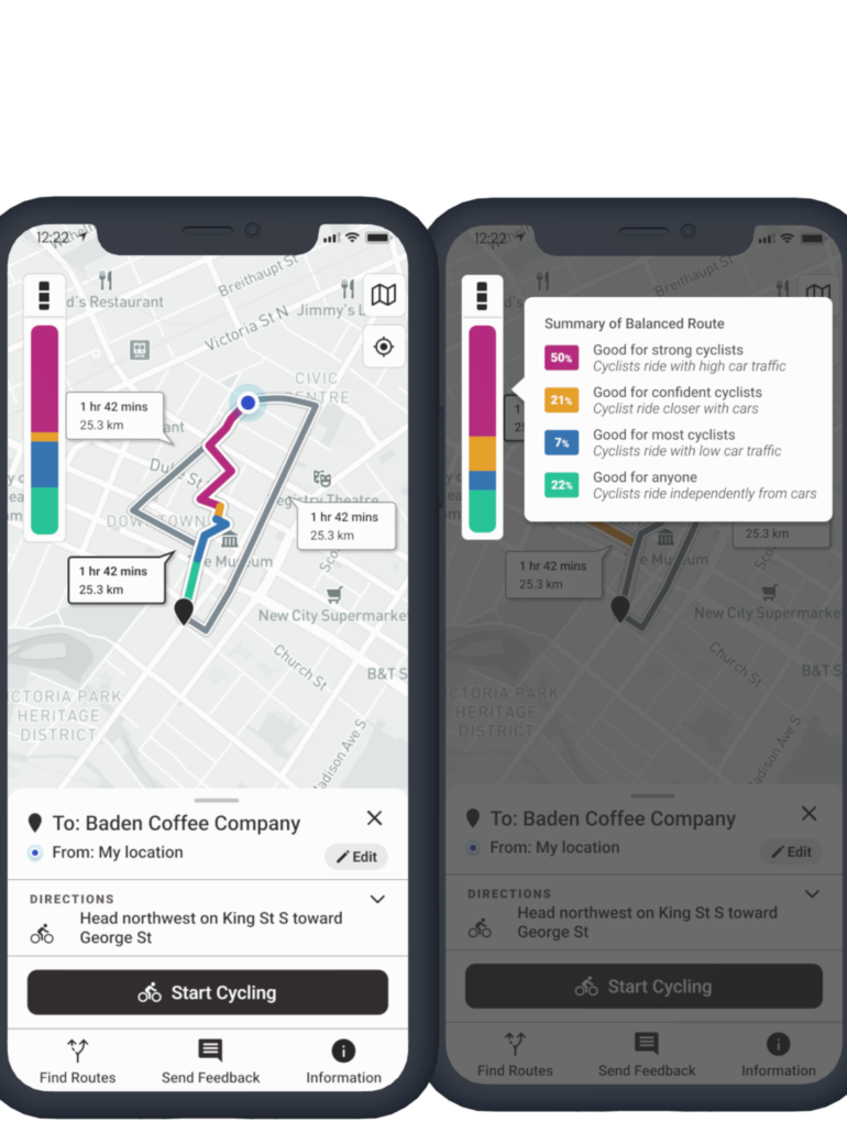
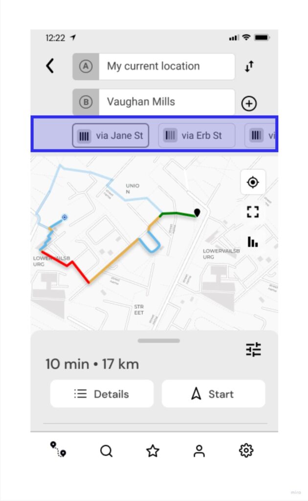
Cycling Guide is a mobile navigation app that provides people with cycling routes based on their comfort level. When a cycling route is selected, coloured segments are presented to convey the safety levels of each road or cycling infrastructure to cycle on.
Project Type
Work Project
Role
UX Designer
Skills Demonstrated
Mobile App Design, Information Architecture, Accessibility
Problem
For cycling commuters, it can be challenging to determine which routes to take due to different personal comfort levels.
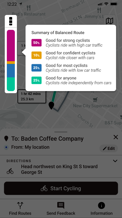
Cycling Guide is able to classify the safety levels of the road segments by using the “Level of Traffic Stress” framework. This framework is used for evaluating and highlighting bike network planning, and the app uses it to generate routes based on users’ preferences. Since the Level of Traffic Stress framework uses jargon, this screen needed inclusive language for commuting cyclists with any level of cycling experience to understand.
Outcome
The project’s goal was to help commuting cyclists make an informed decision about which cycling routes to pursue based on their comfort and needs. A message tooltip overlay was created to provide cyclists with helpful information about the safety levels on various road segments. This screen would empower cyclists to make informed decisions about their routes. Other information, such as time, duration and elevation details, was organized in a panel that can be expanded.
Process
Brainstorming – how might we represent the level of traffic stress?
Since commuting cyclists mainly consider the “Level of Traffic Stress” alongside trip duration and distance in deciding which route to pursue, I had to figure out how to represent the level of traffic stress for this screen design.
Sketches
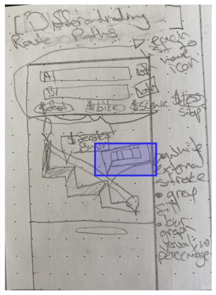
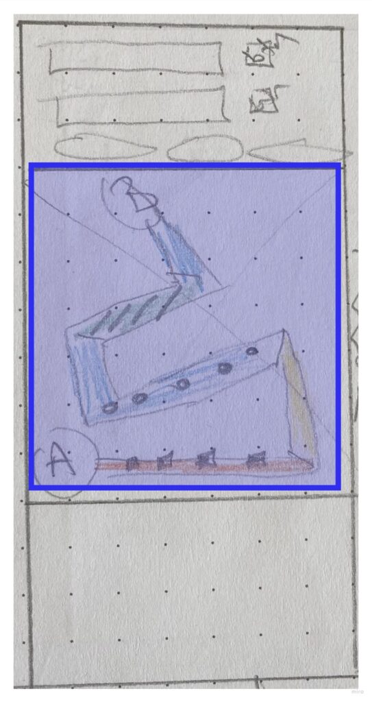
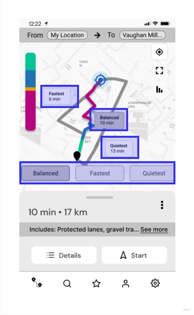
First, I sketched how the route labels and traces could show the traffic stress levels on the screen. This led me to create a color palette to define the stress levels of road segments, so cyclists can easily see which segments have more or less traffic stress.
Designing Components and Functionalities
Most of my design iterations focused on core user interactions when designing the layout and the mandatory interactions on this screen. Some of these were:
Selecting a route either by tapping on a route trace or route label
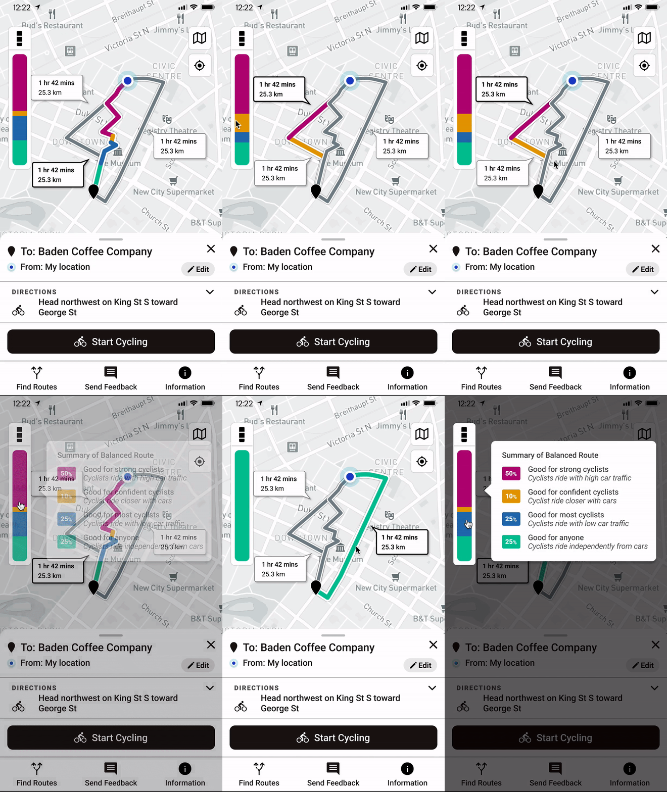
It was important for users to intuitively know how to explore different routes that can be done in multiple ways. When looking at the screen, they should be able to differentiate between selected route traces versus those that weren’t.
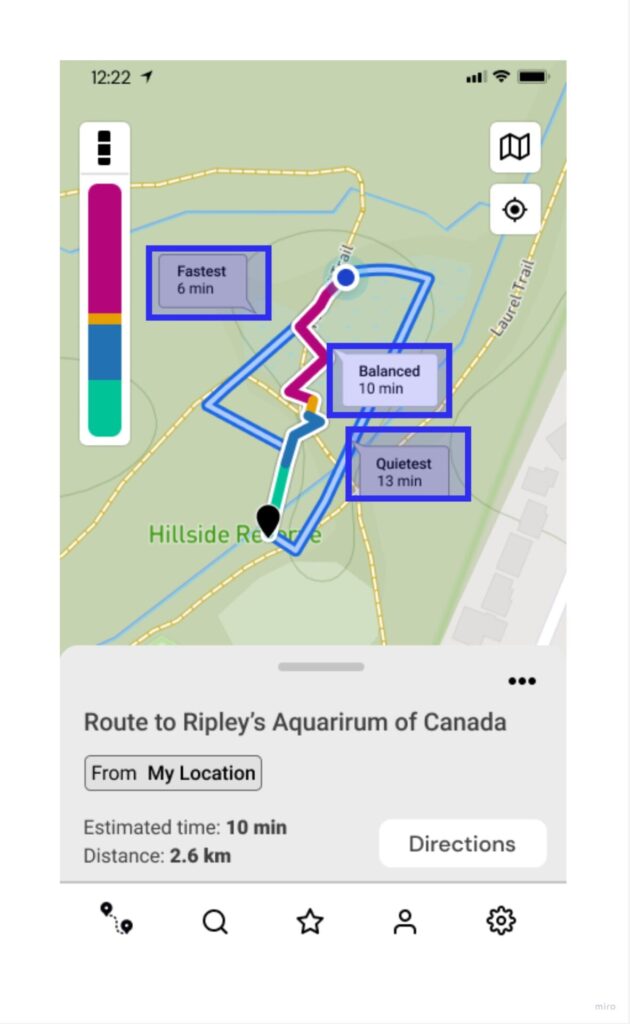
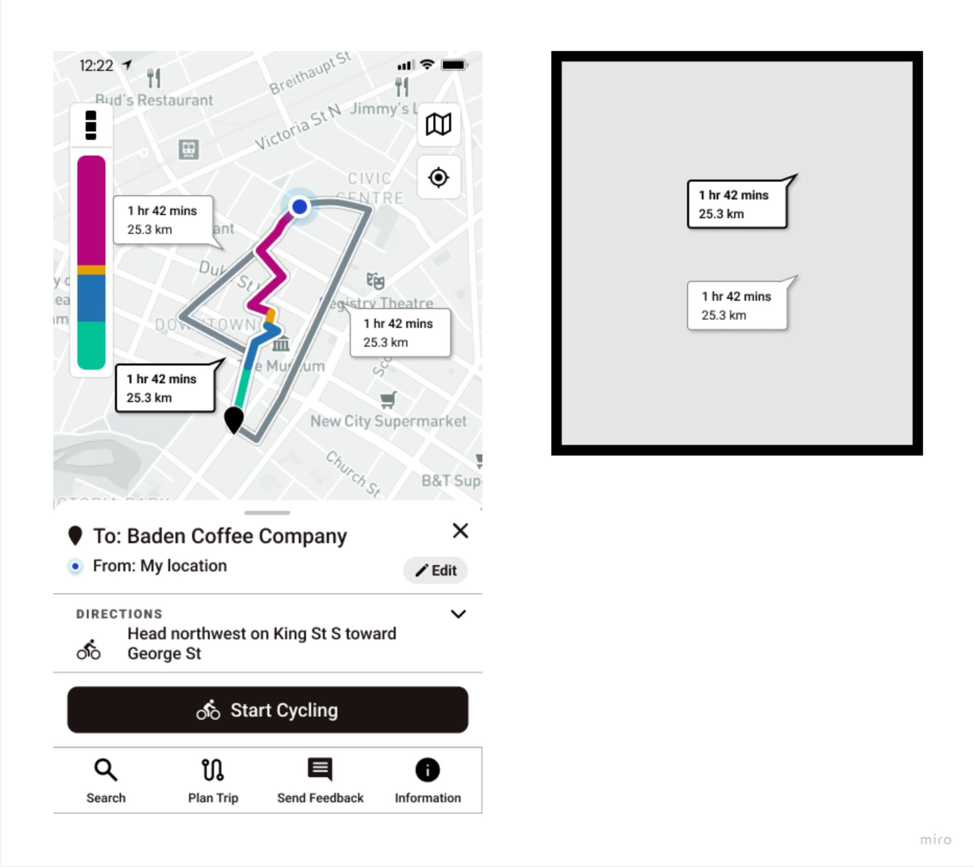
Here are some concepts for designing route trace labels in selected and non-selected states
Understanding the different levels of traffic stress of a route in summary and in detail
Since the principal value of this app was to provide navigation support to people with different levels of cycling experiences — beginner and experienced cycling commuters should be able to interpret the safety and stress of selected routes and decide which route options are suitable for them.
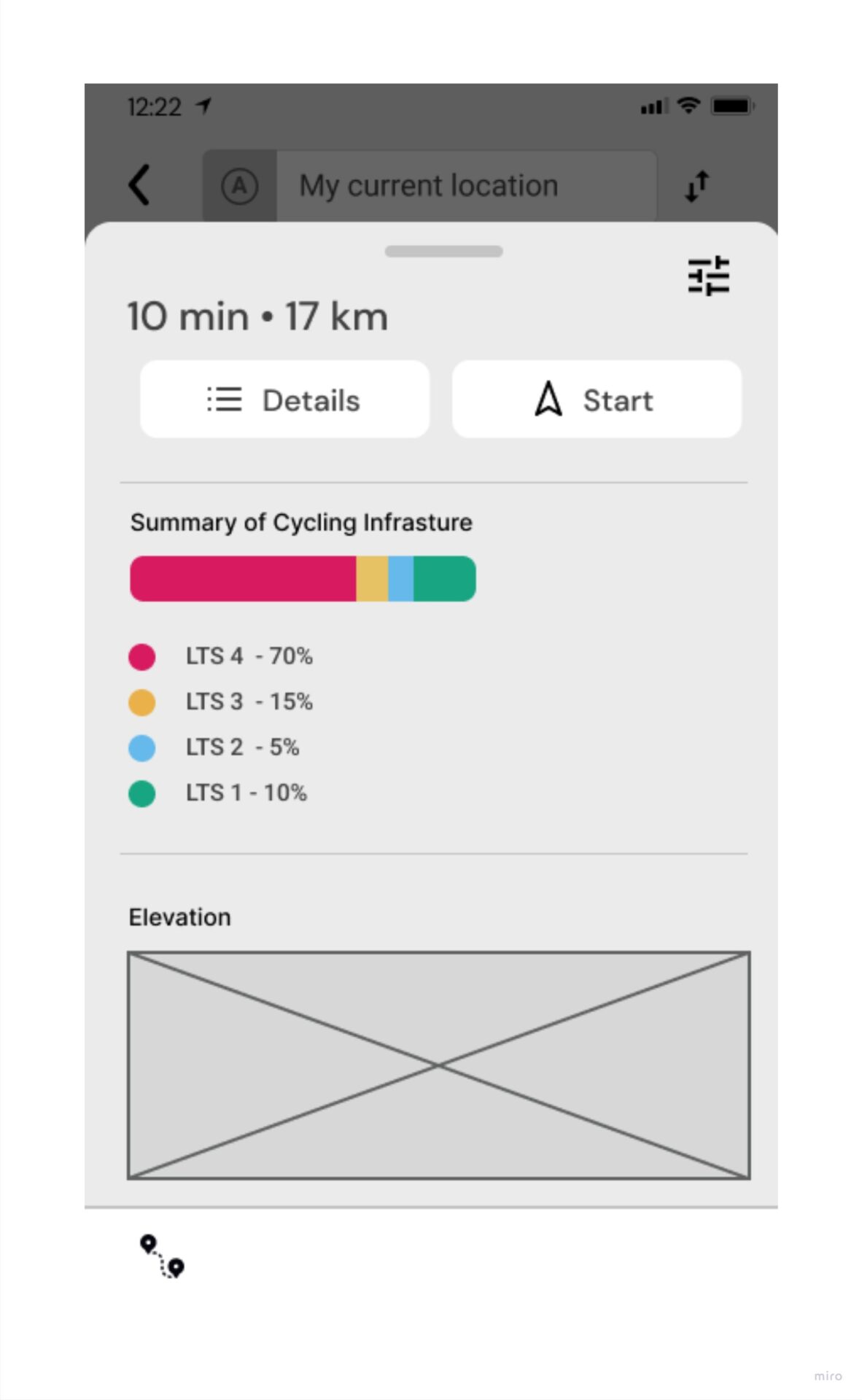
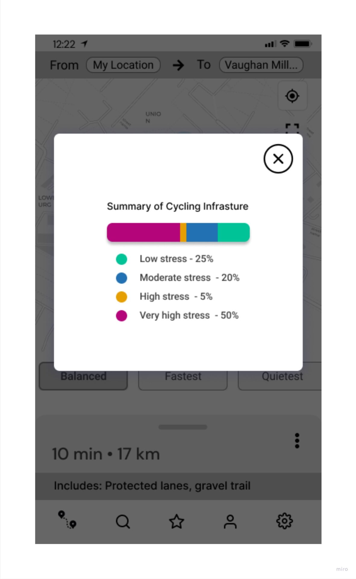
A bar graph is essential for visually summarizing the level of traffic stress data of a cycling route.
Conducting usability testing to evaluate comprehension information
I conducted usability testing on this screen to answer the research question, “Can users know which route is high stress vs. low stress without labels?”
Insights from study
Most participants’ instincts were aligned with the Level of Traffic Stress (LTS) colour meanings.
Here is a quote from one of the participants:
So I’m going to like assume that green is kind of like best case cycling, like a multi-use trail or a separated bike lane and kind of color gradations from there, like blue, maybe mid-level and yellow, maybe a little, a little riskier.
– from participant
Design Solutions
Final Decision on Design Concept for Route Label and Route Traces
Providing information and control for users to judge a route
To differentiate between selected and not-selected route traces, the selected route traces will show coloured stress segments of the roads of a route, while the non-selected traces are grey.
Characterizing data to human language
Another area of helping commuting cyclists understand which route would be appropriate for them to use, I had to characterize numerical data and level of traffic stress jargon, so users could know what a cycling route means to them. I did this by designing a bar graph button displaying a stacked bar graph and presenting a summary tooltip overlay.
Knowing what you need to know about a cycling route
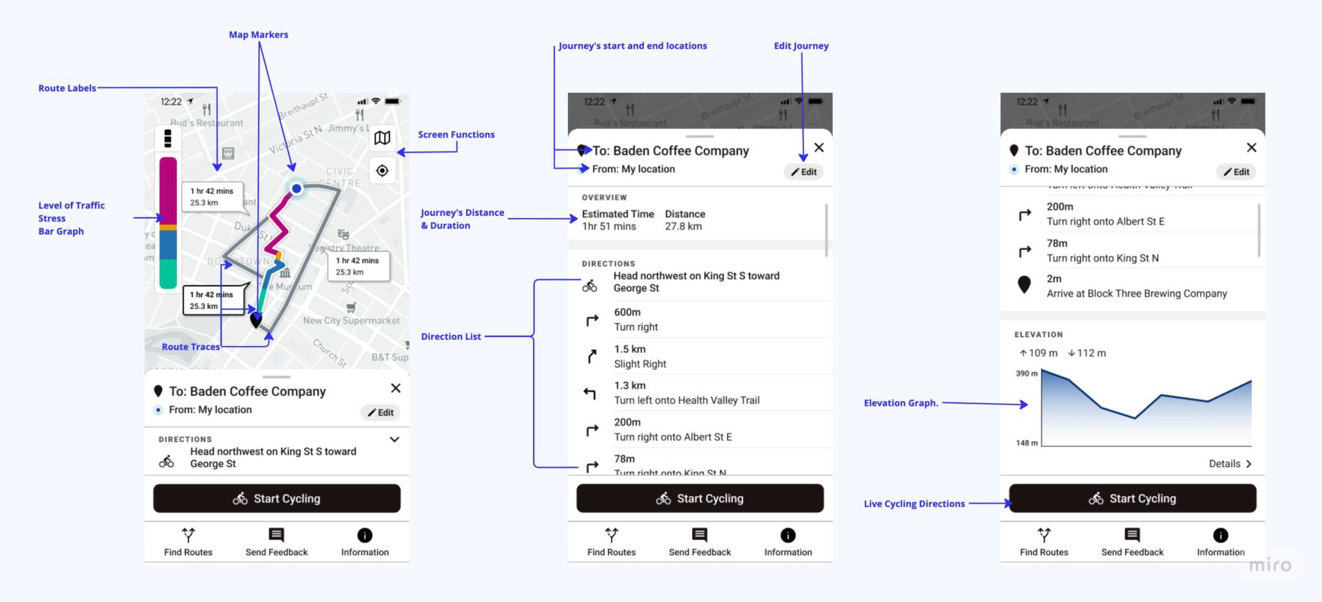
Just like other navigation apps in the market, I had to find a solution including other information and related functions of a route. This was all organized in a drawer on this screen.
The image below is an annotation with the additional information on this map screen.
Handoff for Development
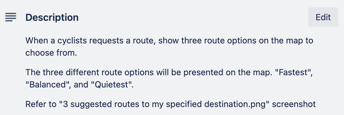
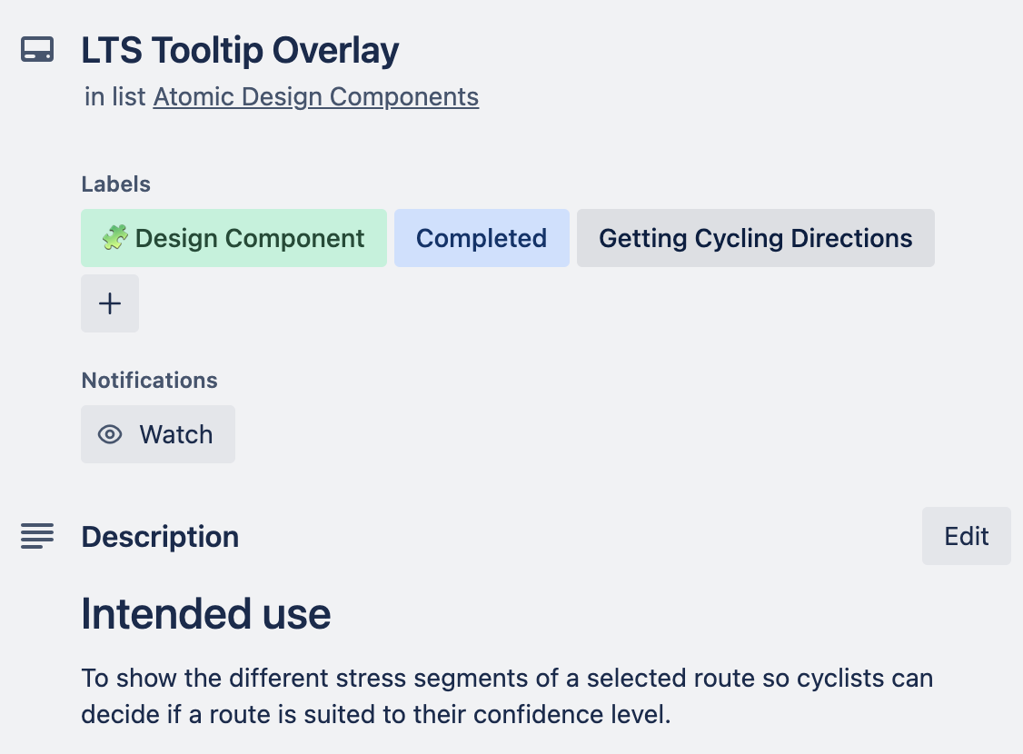
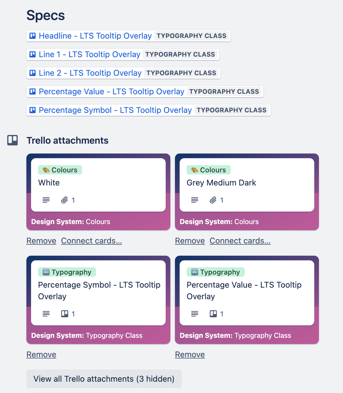
When I was at Zeitspace, as a part of my handoff packaging, I would write user stories related to the feature or epic that document details of the feature, acceptance criteria, and annotations of the screen. I also managed the design system for the project, which was organized in Trello.
Sample of User Story Ticket
Sample Documentation for Design System
What I’ve learned
Reflecting on the time I was working on this assignment, I progressed in improving the information architecture and layout on the screen by prioritizing and strategizing how different types of information on the screen can be presented based on interaction. The design components that helped organize this, like tooltip overlays and the bottom drawers, were useful in containing and displaying this key information for cyclists while keeping the objective of exploring the different routes on the screen to make a confident decision.
