Company
Mental Health Counselling (MHC)
Project Overview
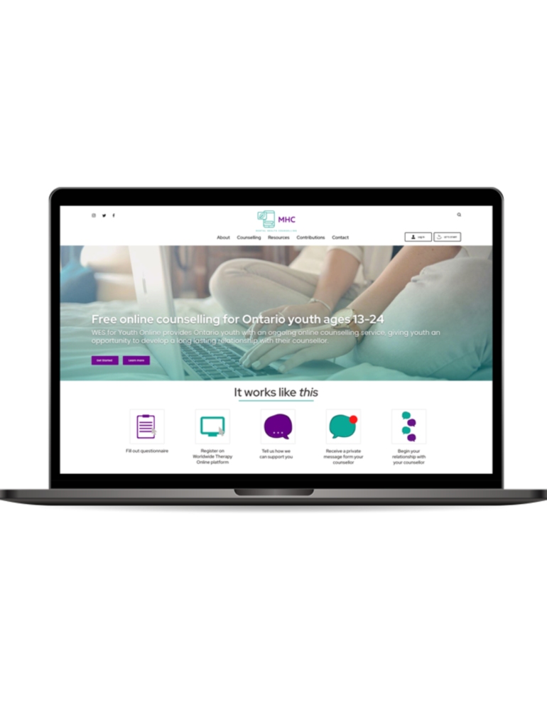
Mental Health Counselling (MHC) is a small non-profit organization that provides free online counselling for Ontario youths aged 13-24. This service is done through a third-party website where Ontario youths must meet with their counsellors. The application for youths to be matched with a counsellor is managed by the organization’s Communications Director, who supports them in the process.
Project Type
Work Project, Website Redesign
Role
UX Designer
Skills Demonstrated
UX Strategy
Problem
Ever since the pandemic began, they’ve gotten more attention for their online counselling. This resulted in higher inquiries of how their service operates, how to change their passwords, how secure their platform is, and other questions. These inquiries were overwhelming for the Communication Director alone in handling all these inquiries. The main problem in this project was that the website’s navigation was unclear, which was the cause of the high number of questions and high bounce rate, which affected their target users, who are Ontario youths.
Outcome
To help this target user group find the information needed to register for online counselling and minimize inquiries, I’ve redesigned MHC’s website by using certain UI elements and patterns to guide users through navigating the website and comprehending information better.
Process
Understand how the end-users “experience” the registration process
During the stakeholder interview, it was learned that their end-users were Ontario youths. Before redesigning their website, Ontario youths accessed the online counselling service to find out about the organization online or from word of mouth. Then, they would contact the communications director to learn more about the organization and how to register. Overall, the process of accessing the service was unnecessarily collaborative.
Specify the end-users’ needs
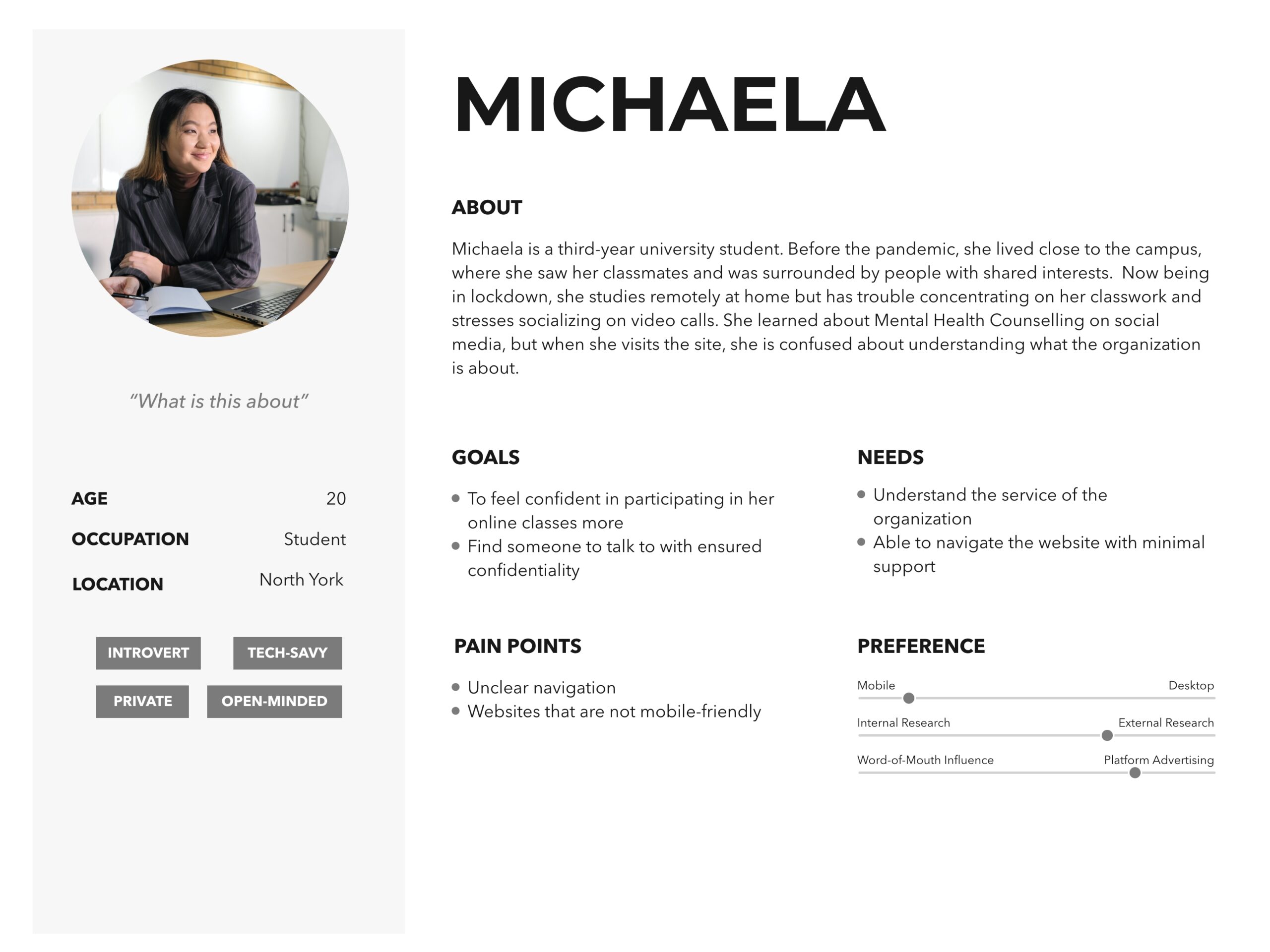
This project is unique because the website’s user experience must be strategic and relevant to users’ needs. To achieve this, a persona was created to resemble Mental Health Counselling end-users as much as possible. Mental Health Counselling analytics and surveys were reviewed to understand the end-user. Below is the persona created to know Mental Health Counselling’s end-users.
Identifying the problem
From this foundational research, the core problem for the Ontario Youth group was that they did not know how to access the third-party platform to have a session with their counsellor.
Design Solutions
In focusing on solving the confusion of accessing the third-party platform for Ontario Youths, these were my design solutions:
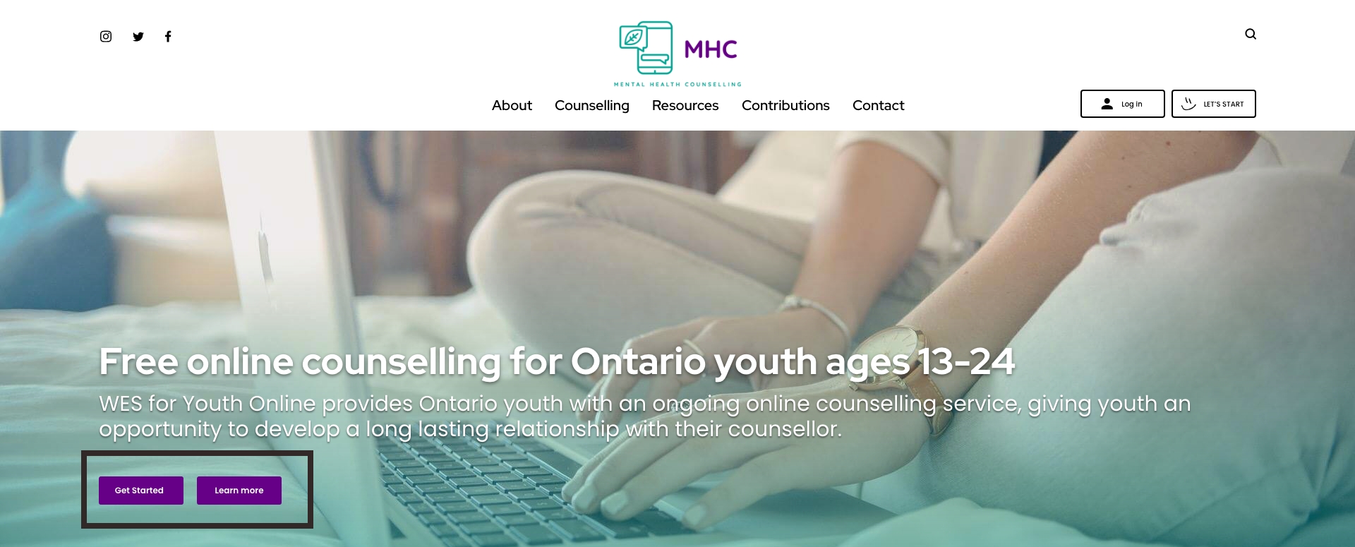
1. Create a call-to-action (CTA) hero banner on the homepage.
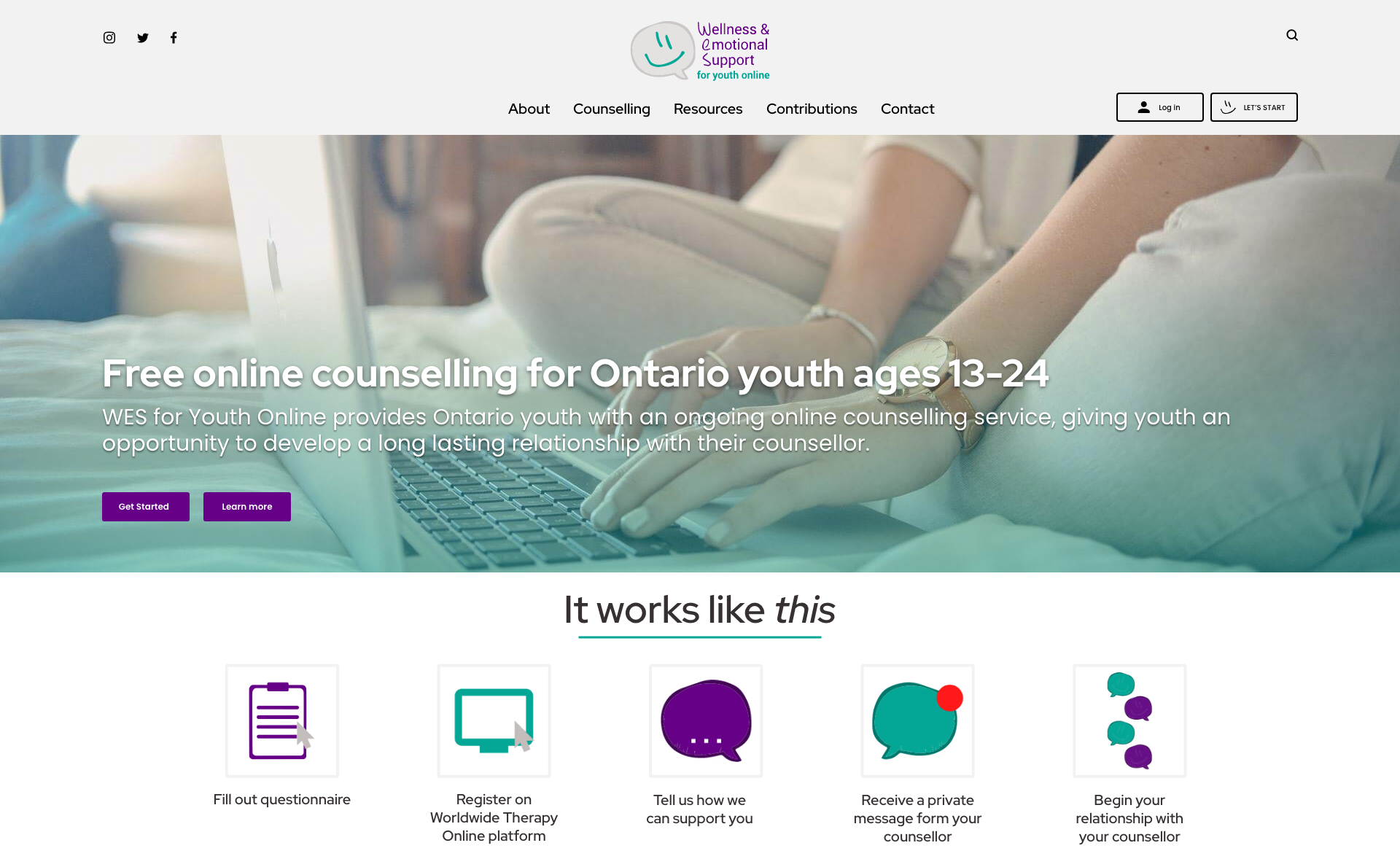
The homepage is the first page Ontario Youths arrive at by visiting the link from social media, a search engine’s result page, or sent from a friend. The individuals in these user groups may be new, so the call-to-action buttons within the hero banner will allow them to learn more about online counselling through the “Learn more” button or “Get started” button to go through the registration process.
2. Create a visual breakdown of how online counselling works on the homepage
To complement the “*call-to-action (CTA) hero banner*” I placed a visual breakdown of how online counselling works. This was done with the intention of priming users’ understanding of how online counselling works. Visuals were used to maintain users’ interest in this area since users usually skim the homepage.

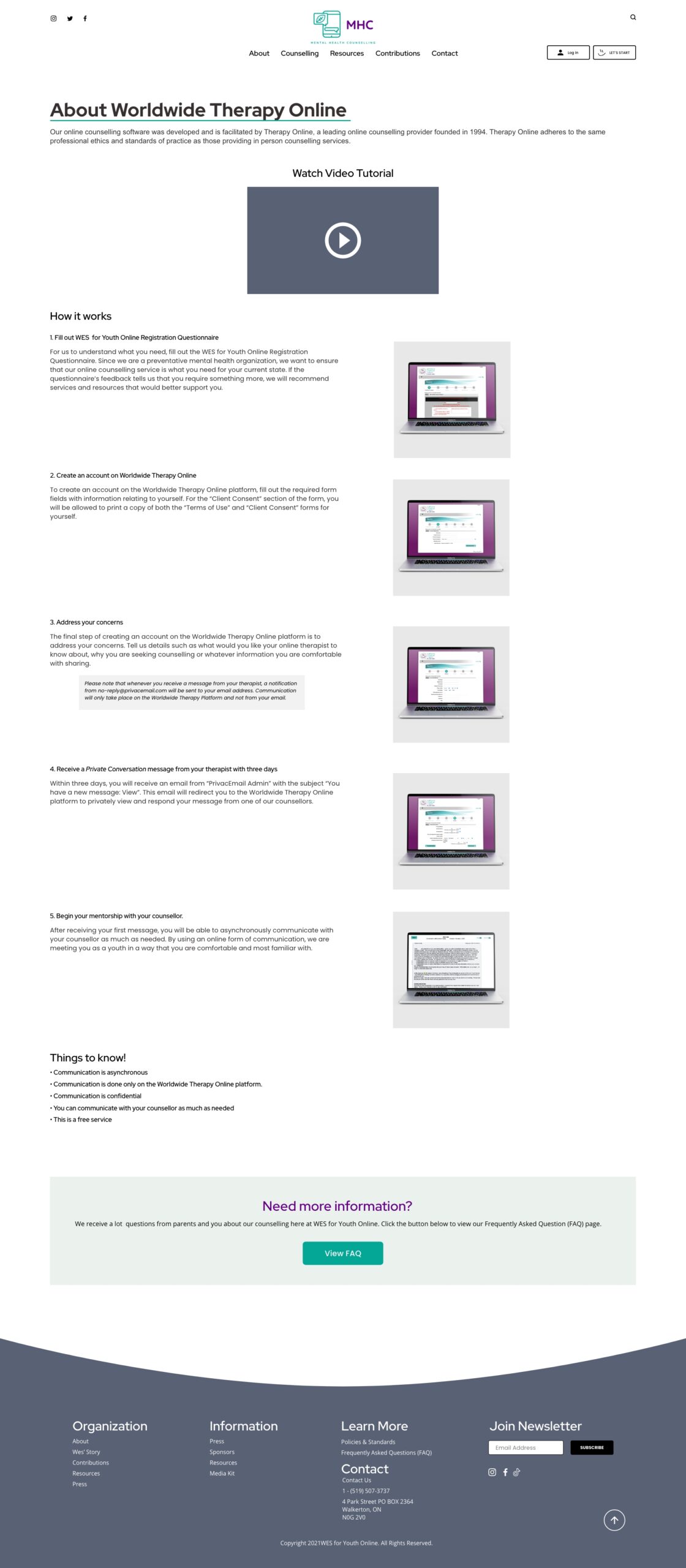
3. Create a page about how online counselling works within the third-party platform
I designed a page to summarize the platform and provide an overview of the registration process and how communication with the youths’ counsellor is done. Since the page was focused on teaching users how to use the third-party platform, I relied on the support of the copywriter to detail the tutorial for users to comprehend. In addition, to make sure that this page was inclusive to users of various learning styles, I ensured that the written tutorial was complimented by visuals and included a voice-over video tutorial.
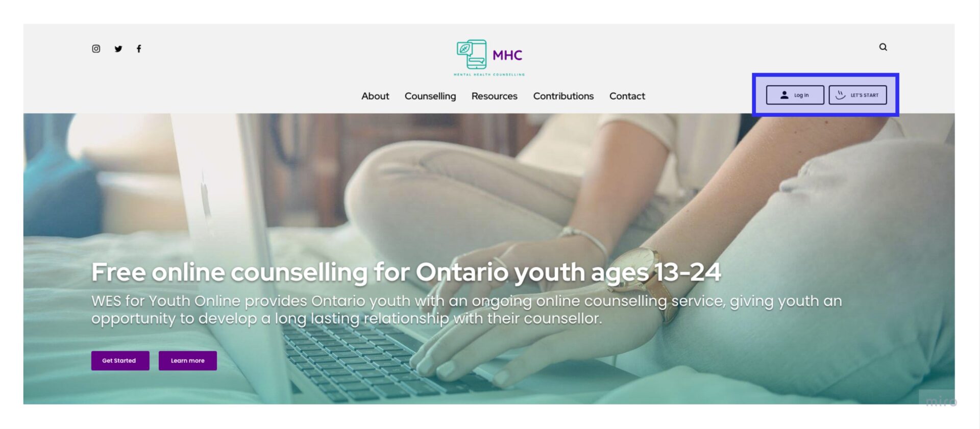
4. Featured “Log-in” and “Let’s Start” in the header
The “get started” button was included for easy access for users familiar with how online counselling operates and just want to jump in and register. Since this organization expects these users to visit the website often for their counselling sessions, the “log in” button was included for ease of access for current youths involved in the service. Also, the “get started” button serves as a “touchpoint” for other web pages that don’t have a link to the registration page and rather than circling back, users can easily click that button to register.
Feedback
As mentioned, the earlier opportunity for research was limited, and most of the duration of this project was focused on adapting the designs to the faulty WordPress theme. However, when I followed up with the business owner after the project ended, she said that she received fewer inquiries about the process of registering for online counselling and noticed that youths could log back into the third-party platform for a session with their counsellor even from their mobile.
Handoff for Development
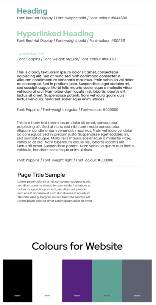
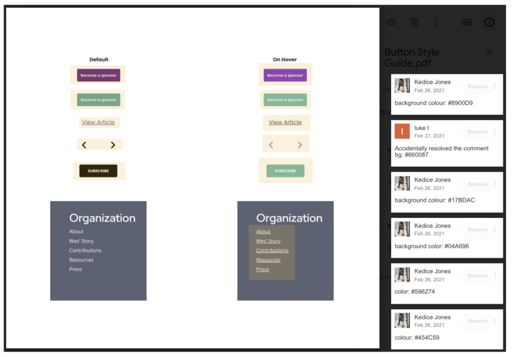
In working with the developer, I would put together a “web style guide” highlighting the font – pairings details, colours and other design information needed for building out the web pages.
What I’ve Learned
For this project, I initially assumed that I would use the lean UX framework due to the short duration of the project. However, this business owner was focused on optimizing the website for end-users’ needs; I found myself transiting into using more of the user-centred design process when designing solutions to solve the problem of users’ confusion of not knowing how to have a session with their counsellor. This transition was difficult because I relied on designing a feasible solution quickly but limited primary data about the users. But at the same time, I was motivated to help Mental Health Counselling as much as possible because, as a small non-profit organization, they are creating a good impact in Ontario.
