Personal Project Overview
October is for Breast Cancer Awareness here in North America. When I was a Society President for a club during my undergraduate studies during 2018-2020, I’ve continued a tradition called GH Goes Pink. When Adobe Announced the Daily Creative Challenge, I decided to pursue the Event Landing Page Design Challenge and design my version of a landing page for CIBC’s Run for the Cure. Although initially, this was an in-person event, due to the Covid-19, I decided to focus this event as an independent, but virtual gathering where participants can run by themselves safely in their own city.
Project Type
Assignment from Adobe Daily Creative Challenge – October
Role
UX Designer
Skills Demonstrated
UX Design & UX Strategy
Research
Persona
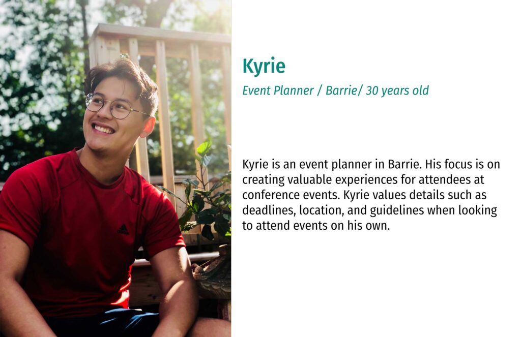
In order to arrive at a landing page, there is a trigger from either an internal or external cues that informs a user of what their next steps should be (this can be from an email newsletter, rich media ad, or a call-to-action (CTA)). From there on, it is up to the user to take to necessary action to arrive at this landing page. With that understanding, I envision the possible users to be technological, be aware that October is the month for Breast Cancer Awareness and are seeking to take part in an event of some kind.
Design Strategy
Phase 1: Low Fidelity
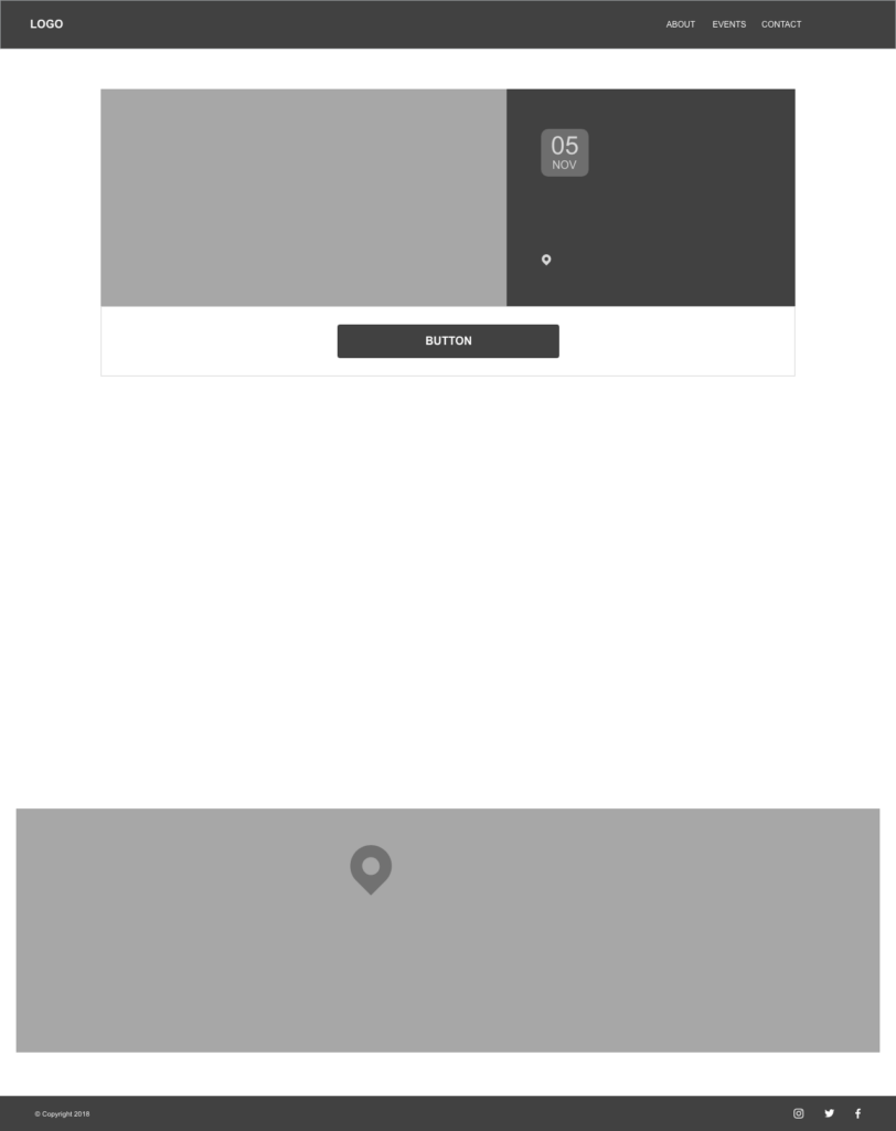
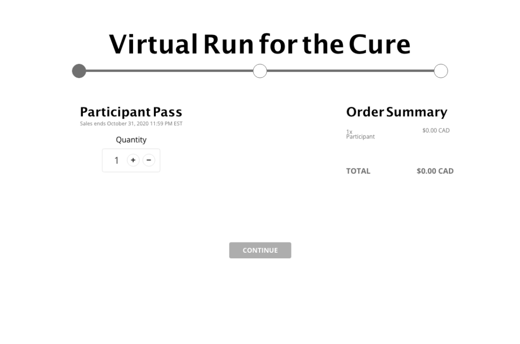
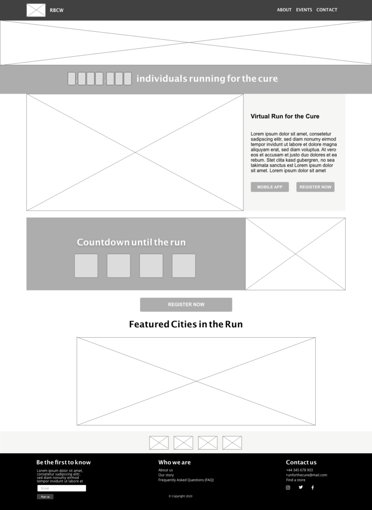
A low fidelity mockup was provided by Adobe; however, I decided to modify it since I was going to incorporate more elements.
Original Low Fidelity Mockup
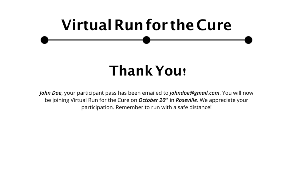
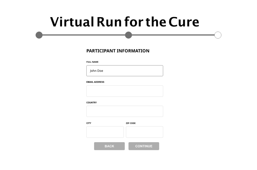
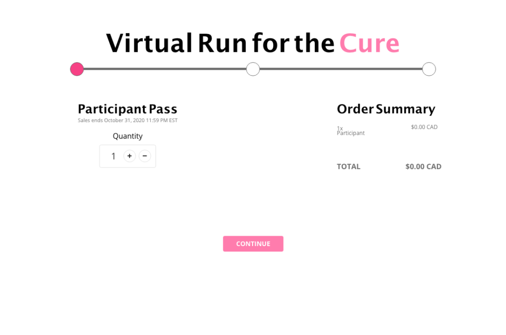
Modified Low Fidelity Mockup
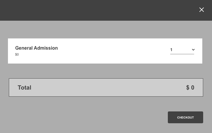
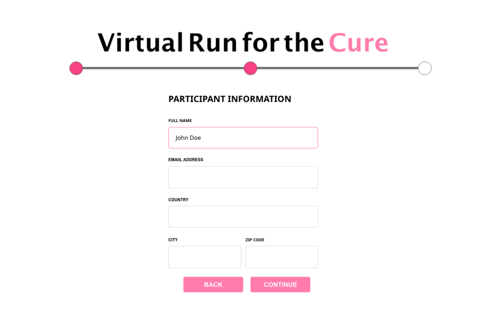
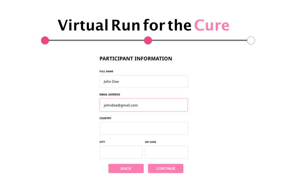
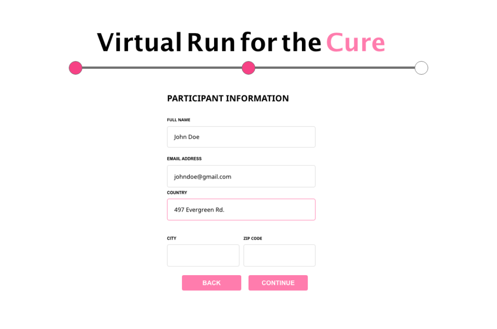
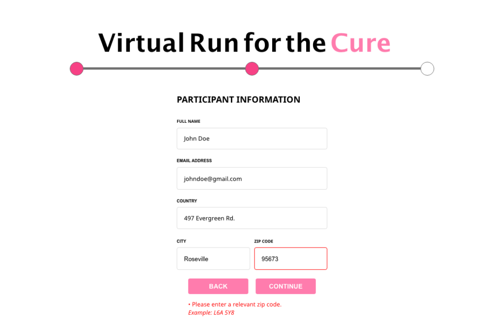
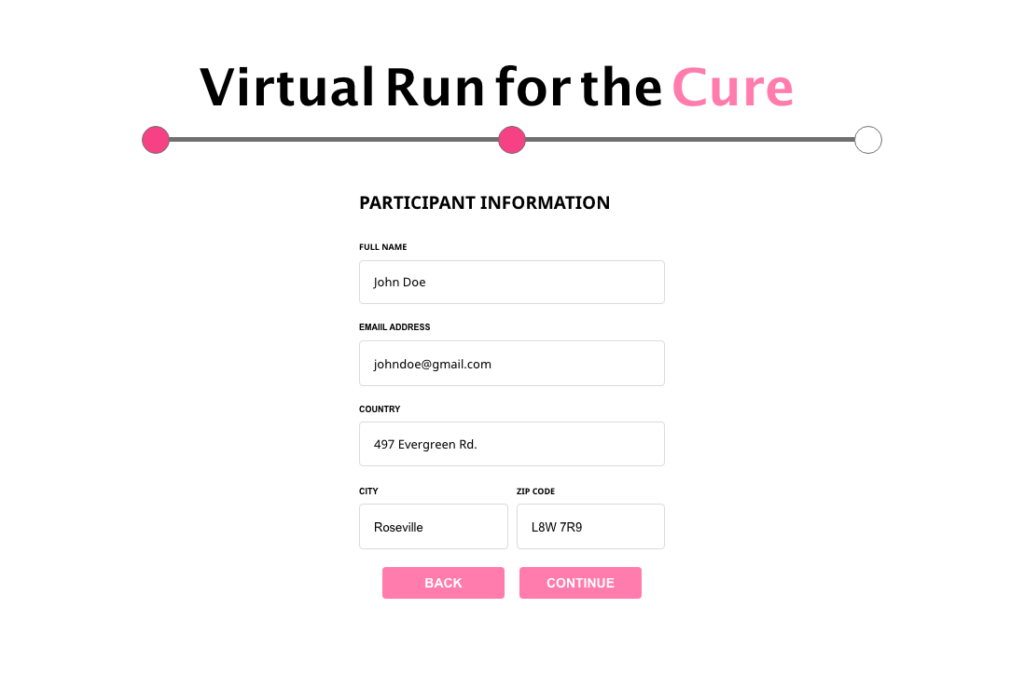
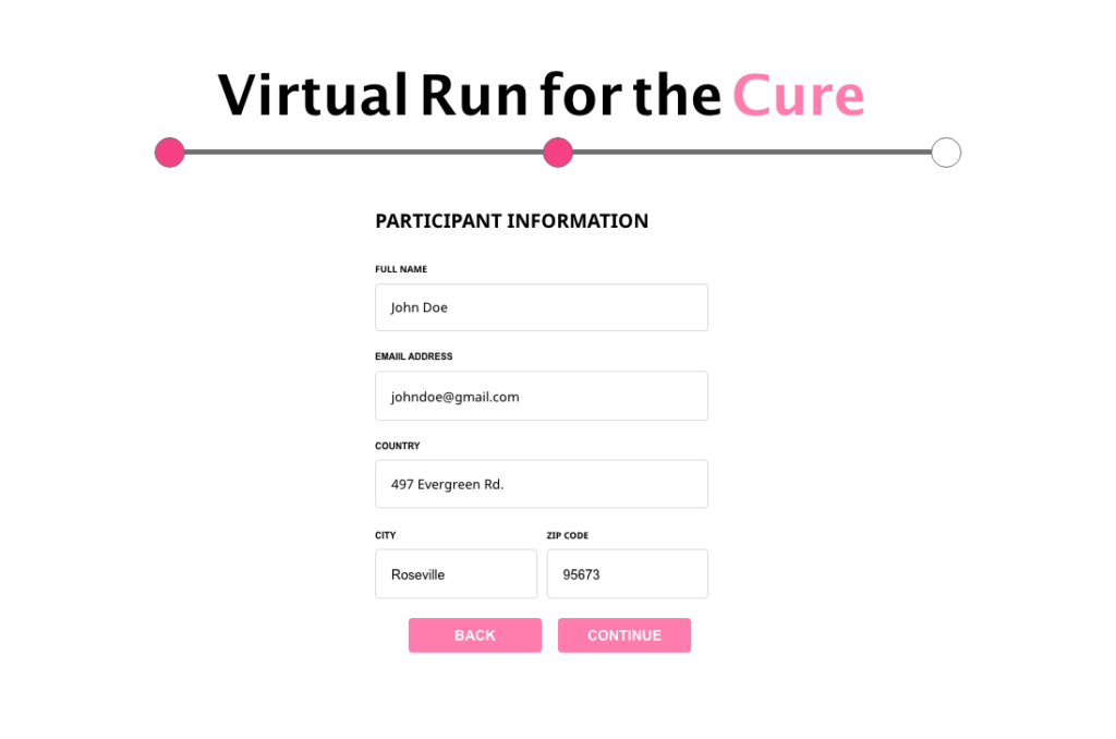
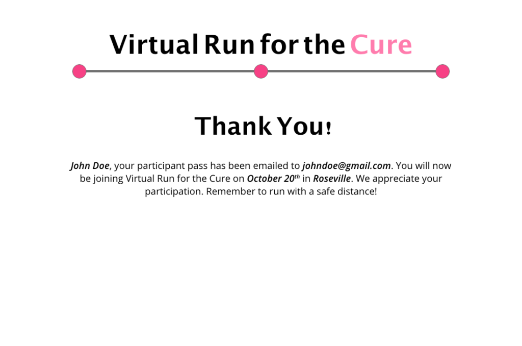
Registration Process:
Phase 2: High Fidelity
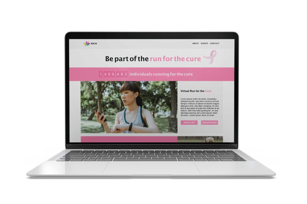
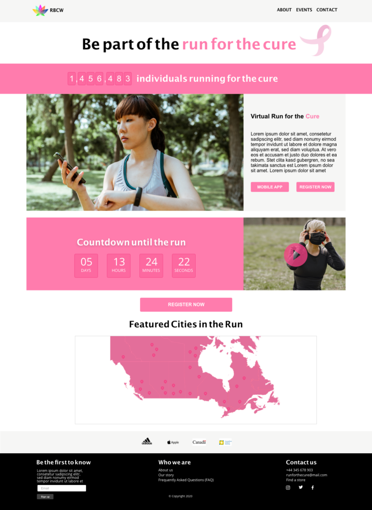
This is the complete version of the event landing page.
Key Elements
In order for a landing page to be effective, it should trigger users to accomplish the action of registering for an event. Below I’ll explain the following key elements.
- 1. Real-time registered participants

To encourage users to be a participate in an event, the tactic of bandwagon effect using quantitative values can be persuasive. The bandwagon effect is referred to as “the tendency people have to adopt a certain behaviour, style, or attitude simply because everyone else is doing it” (www.verywellmind.com). If this was present on a live website, numbers would be changing in real-time!
- 2. Call-to-Action (CTA) Buttons
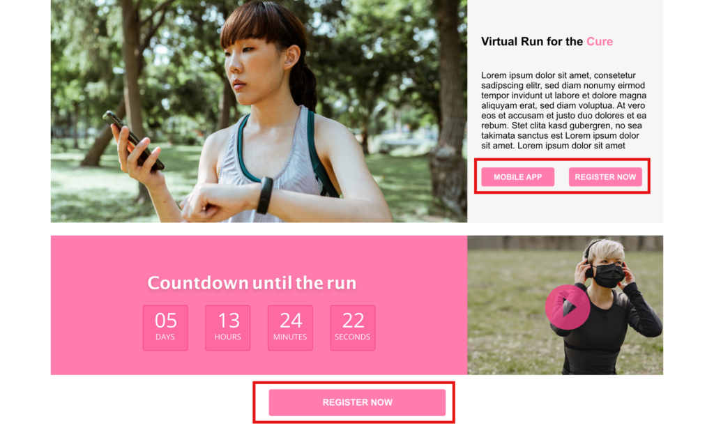
Regular buttons alone aren’t enough to prompt users to take necessary actions. Phrases should be short, but clear at the same time. Also having them in different placement can be effective. In the current layout There are two CTAs, downloading the mobile app and registering for the event. I decided to put two buttons for registering for the event, since that is the main objective of the landing page.
- 3. Countdown Timer

The purpose of the countdown timer is to provoke that urge for users to register for the event as soon as possible. The idea of implying scarcity of anything is more common on e-commerce websites. It has proven to be effective in increasing the objective of making sales, which is why I decided to include this concept on this landing page.
- 4. An interactive map

Since this event is independent and can be done anywhere in Canada, on a live website, this interactive map would be constantly highlighting the locations of registered participants. Although participants or involved in the event independently the purpose of the interactive map is to show how all participants a congregated visually.
Please note that all photography images were used for demo & educational purposes
