Company
Cycling Guide Foundation
Project Overview
Cycling Guide is a mobile navigation app that provides people with cycling routes based on their comfort level. For this project, I designed a feature where commuting cyclists can see the elevation profile of a cycling route to observe and inspect different elevation points while knowing the level of traffic stress of a street or cycling infrastructure.
Project Type
Work Project
Role
UX Designer
Skills Demonstrated
Prototyping, Interaction Design, Mobile App Design
Problem
Commuting cyclists often plan their routes based on the elevation and road grade of the roads they might ride on. However, commuting cyclists don’t realize the impact the changes in elevation and road grade may impact their efforts when cycling until experiencing it in real-time.
Outcome
To address this issue, I worked on designing an interactive graph that allows commuting cyclists to inspect and observe elevation and road grade on a cycling route.
Process
Reviewing user interviews
Before getting assigned to this project, a previous UX Designer conducted user interviews with commuting cyclists to learn how they plan their cycling commute. I reviewed their findings from the interview and learned that commuting cyclists factor in elevation changes when planning a cycling route. Certain roads have a steep incline that is challenging to ride and is usually avoided when pursuing routes to pursue.
When learning about this insight, I know that the Cycling Guide mobile app should address this challenge for people.
Brainstorming placement for elevation information
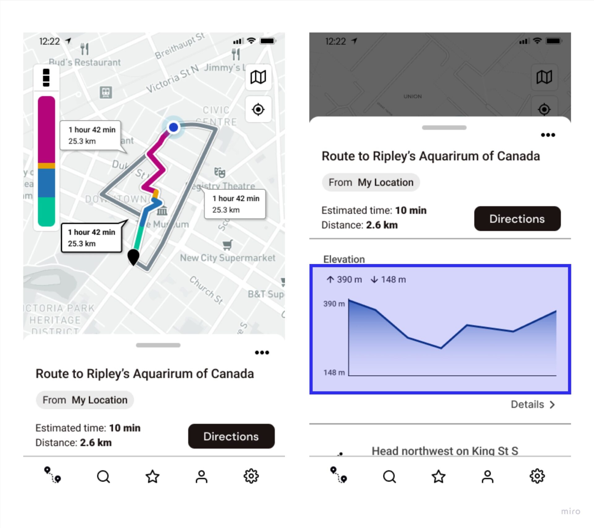
At this stage of this project, the flow for searching and getting cycling routes to a destination was already established. The bottom drawer of the app’s route options screen (see image below) was already used to hold different information about a selected route; therefore, I brainstormed ideas on including elevation details in the bottom drawer component.
Sketching interactions
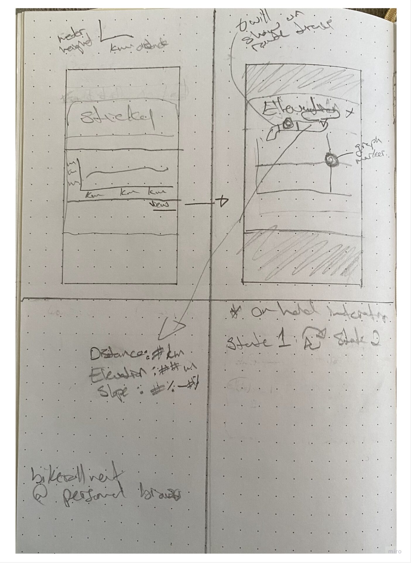
Since the bottom drawer was an appropriate component to include elevation details, I decided to include a simplified version of an elevation graph with a view link that will lead users to see a detailed view of information related to elevation. At this point, I knew this detailed view of the elevation graph would have the cycling route’s distance, elevation, and changes in slope.
Developing Transitions and Functionalities
I had to consider which information I needed to be present for the simplified view of an elevation graph and consider how to make it adaptable to a detailed view for commuting cyclists that find elevation information important.
Simplified view of elevation graph
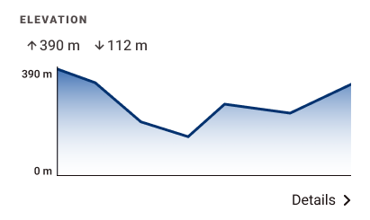
In the simplified version of the elevation graph, the high and low elevation points were visually prioritized. A text link was included to will bring users to the detailed view of the elevation graph.
Detailed view of elevation graph
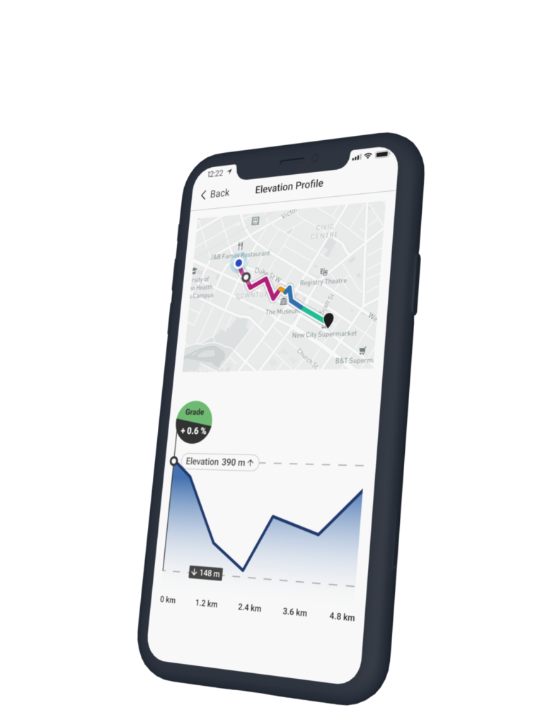
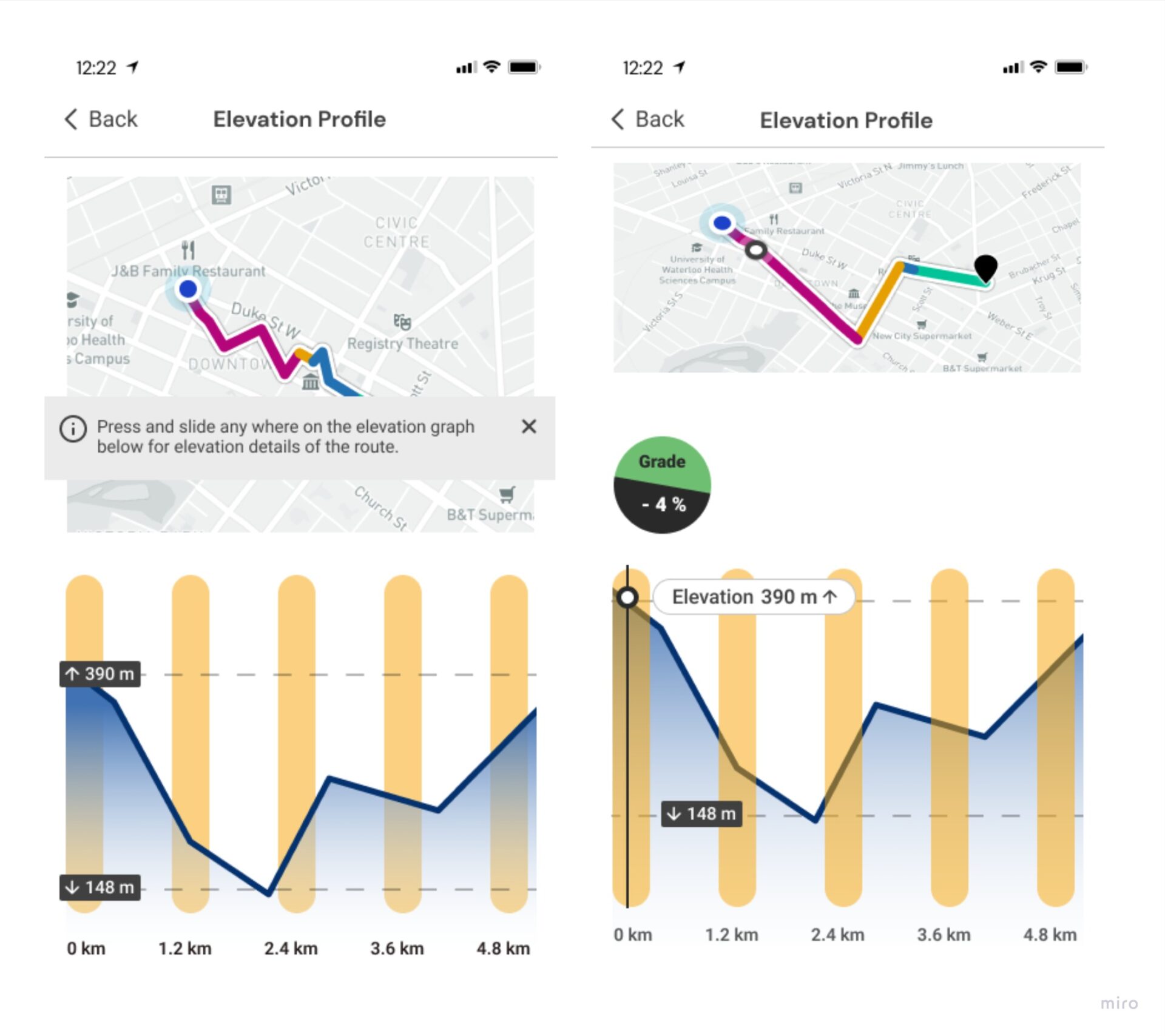
In the detailed view of the elevation graph, I designed a widget that featured the selected cycling route on the map and an interactive graph that will allow commuting cyclists to interact with the graph to inspect the elevation details of the cycling route.
Design Solutions
Presenting elevation details when inspecting the interactive graph
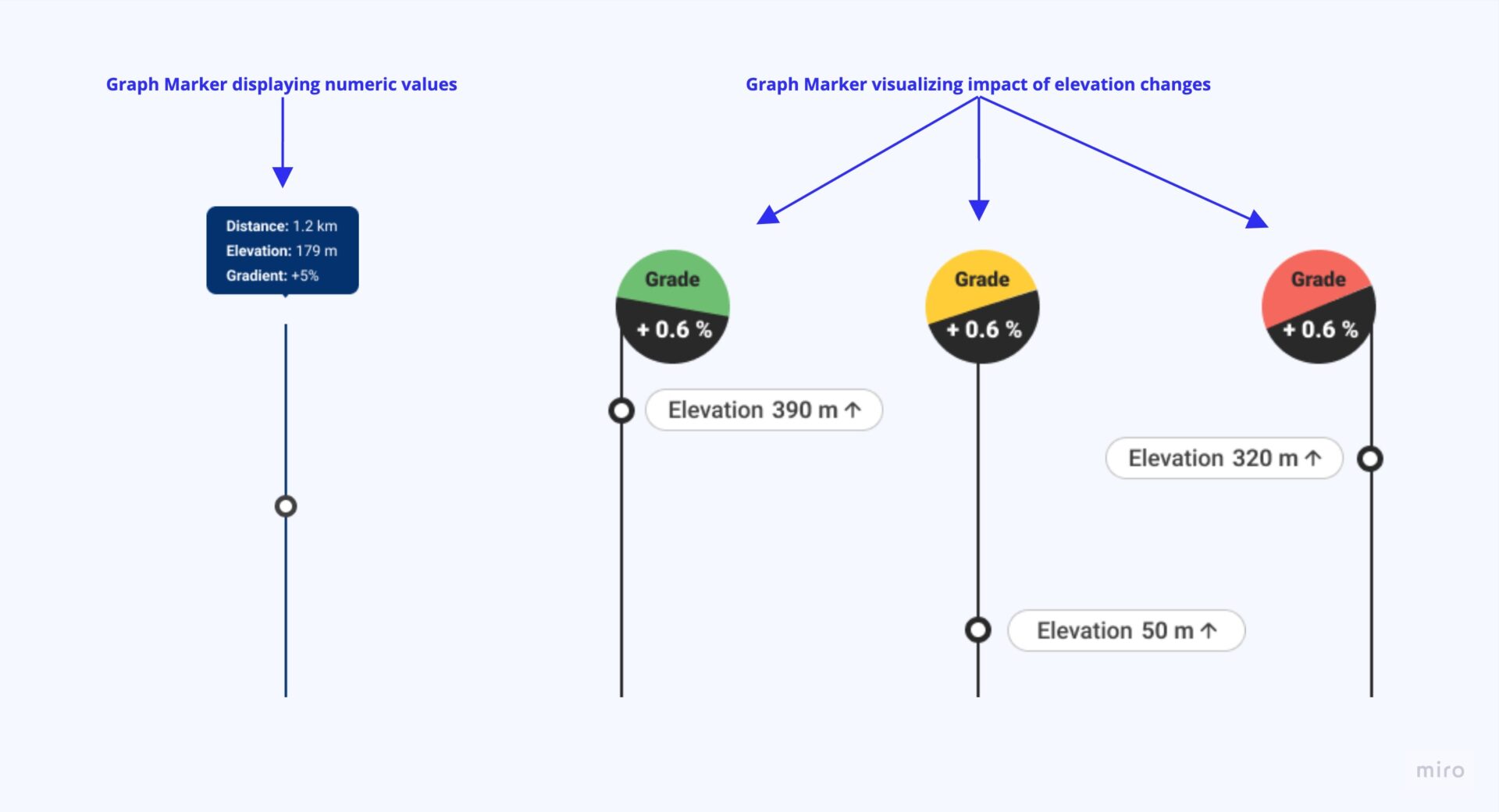
A graph marker will be displayed when the cyclists interact with the elevation graph. The graph marker was designed to illustrate the impact of the elevation changes so commuting cyclists can better understand the changes from the numeric value.
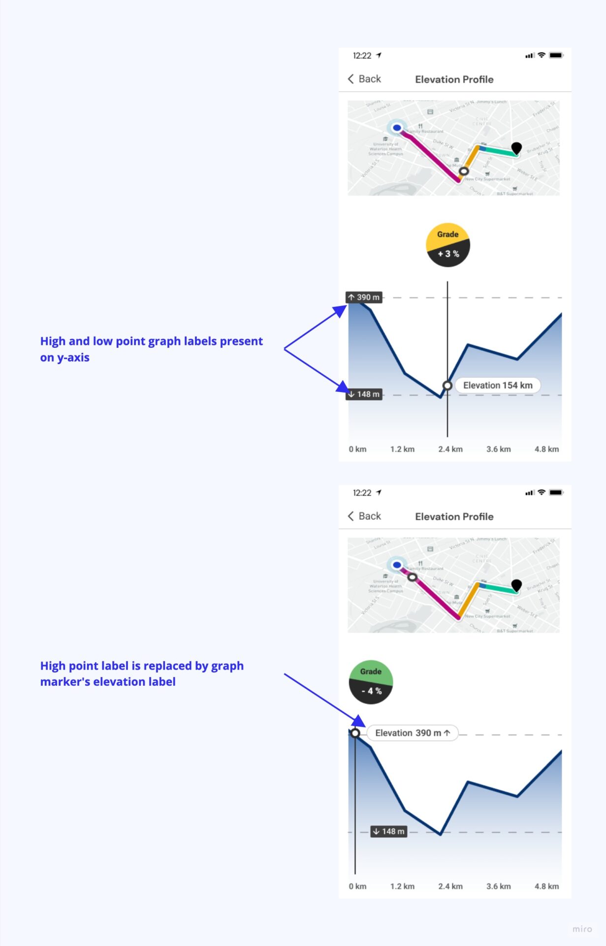
On the y-axis of the graph, I decided to label only the high and low points of the elevation journey vs. the traditional y-axis scale since those were relevant and already present on the simplified version of the graph.
Bridging the awareness gap of elevation changes and points on the cycling route
Cyclists need to know how and where elevation changes are on the chosen cycling route.
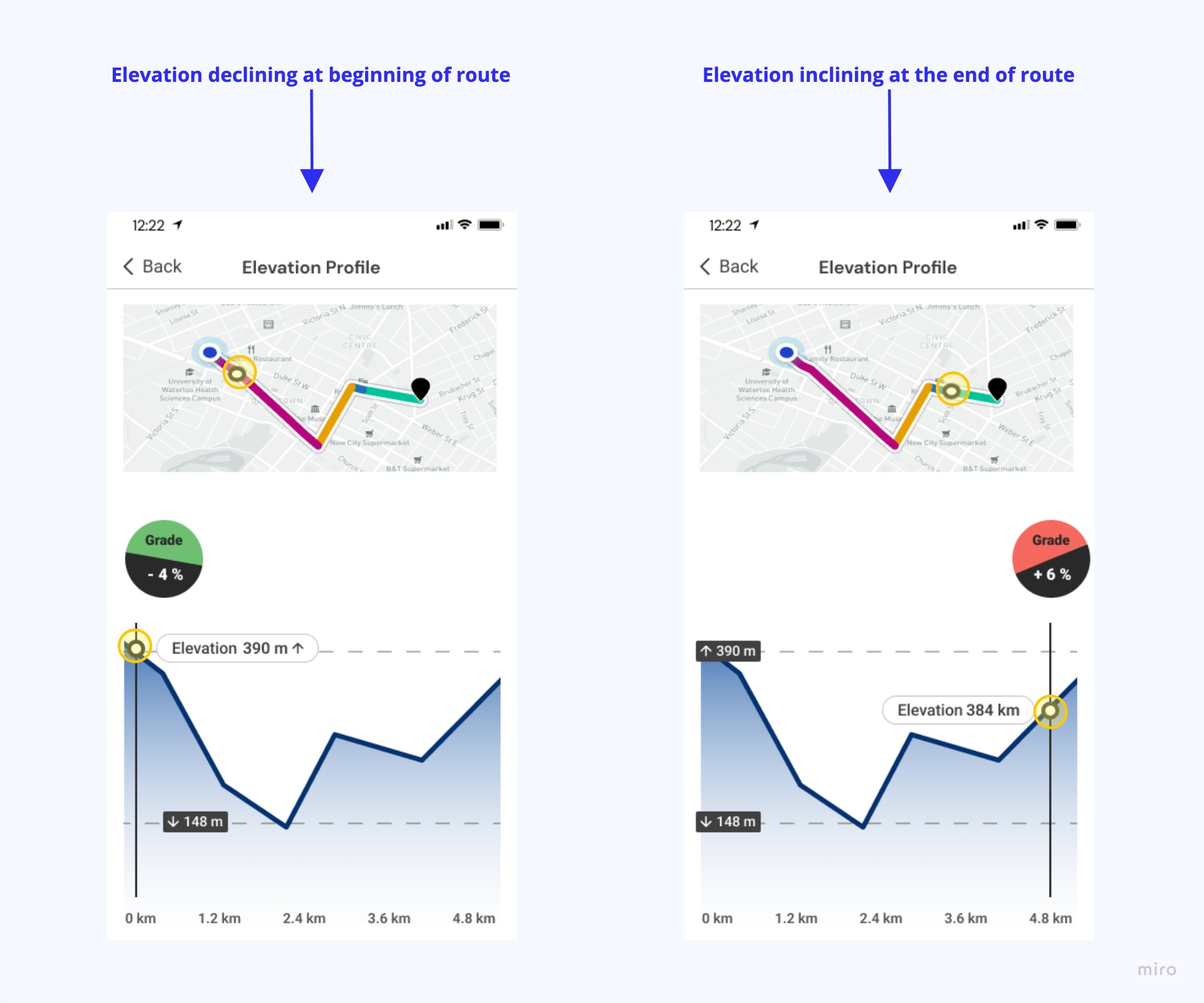
To bridge this awareness gap, I included a smaller map view that only showcased the selected route with a marker that pinpoints and relates to the position a user inspects on the elevation graph.
This was useful for commuting cyclists because they could see which streets had steep changes or were mostly flat while still knowing the level of traffic stress.
Handoff for development
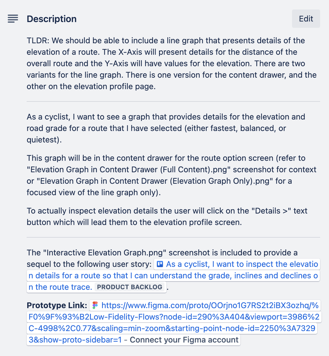
When I was at Zeitspace, as a part of my handoff packaging, I would write user stories related to the feature or epic that document details of the feature, acceptance criteria, and annotations of the screen.
What I’ve learned
Working on this feature design has allowed me to develop my skills in interaction design, specifically for mobile apps. As this feature is centred on presenting a mathematical model — in this case, elevation, it encouraged me to understand abstract topics ( in this case, it is the calculation for elevation). Also, to understand that topic, I need to know what and how specific slope changes impact cyclists; therefore, this required me to come up with a design that visually presents the impacts. From that experience, I learned how important it is for a designer to work on a complex subject to find a design solution that makes complex subjects easy to understand for people.
