Company
Cycling Guide Foundation
Project Overview
Cycling Guide is a mobile navigation app for people with different cycling experiences. One of the key flows in the apps was to help people search for places that are relevant and easy to accomplish as a user, no matter if they are planning a commute ahead of time or on the go (or on the bike, for this case).
Project Type
Work Project
Role
UX Designer
Skills Demonstrated
Mobile App Design, Prototyping, UX Strategy
Opportunity
How can we make searching for places easier for people who cycle so there isn’t much executive thinking involved?
Outcome
To support commuting cyclists with searching for places more efficiently, I designed options for different ways to search for a place depending on the available information and how results are presented.
Process
Investigating
To understand what makes a navigation app effective and a seamless experience for users, it was important for me to investigate and familiarize myself with the common workflows, best practices, and key components of navigation apps.
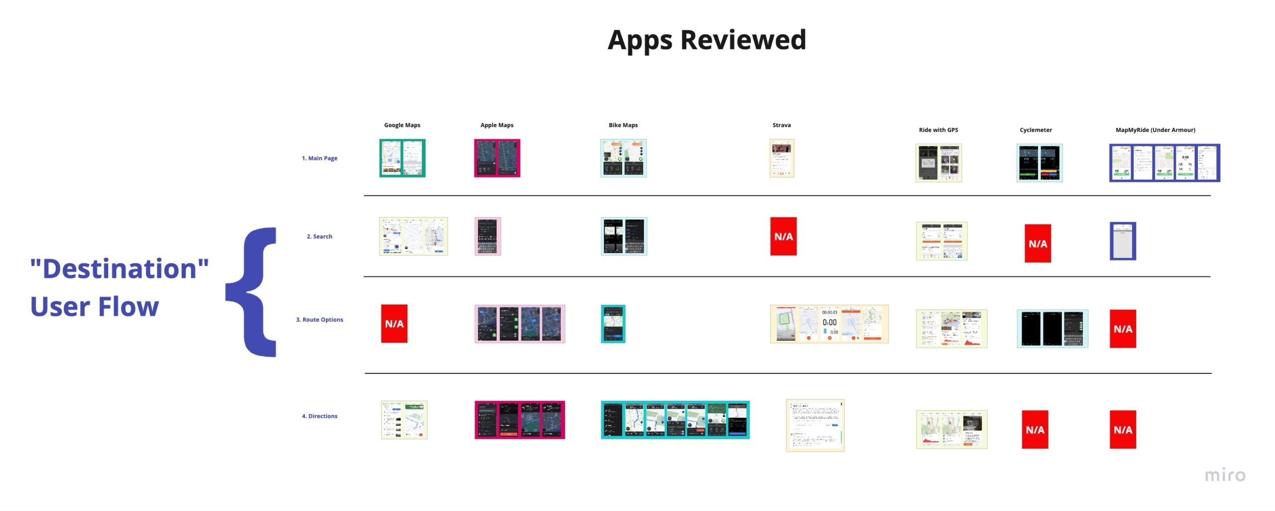
Therefore, I conducted a competitive audit of various navigation apps to understand their workflows and components.
Findings from the competitive audit
The apps I reviewed when conducting were direct and indirect of the “navigation” app category. These apps were:
- Google Maps
- Apple Maps
- Bike Maps
- Strava
- Ride with GPS
- Cyclemeter
- Map my Ride
Design Solutions
To optimize this navigation app to be cycling-centric for the users’ needs, I designed two solutions to help people find places they were commuting to by cycling.
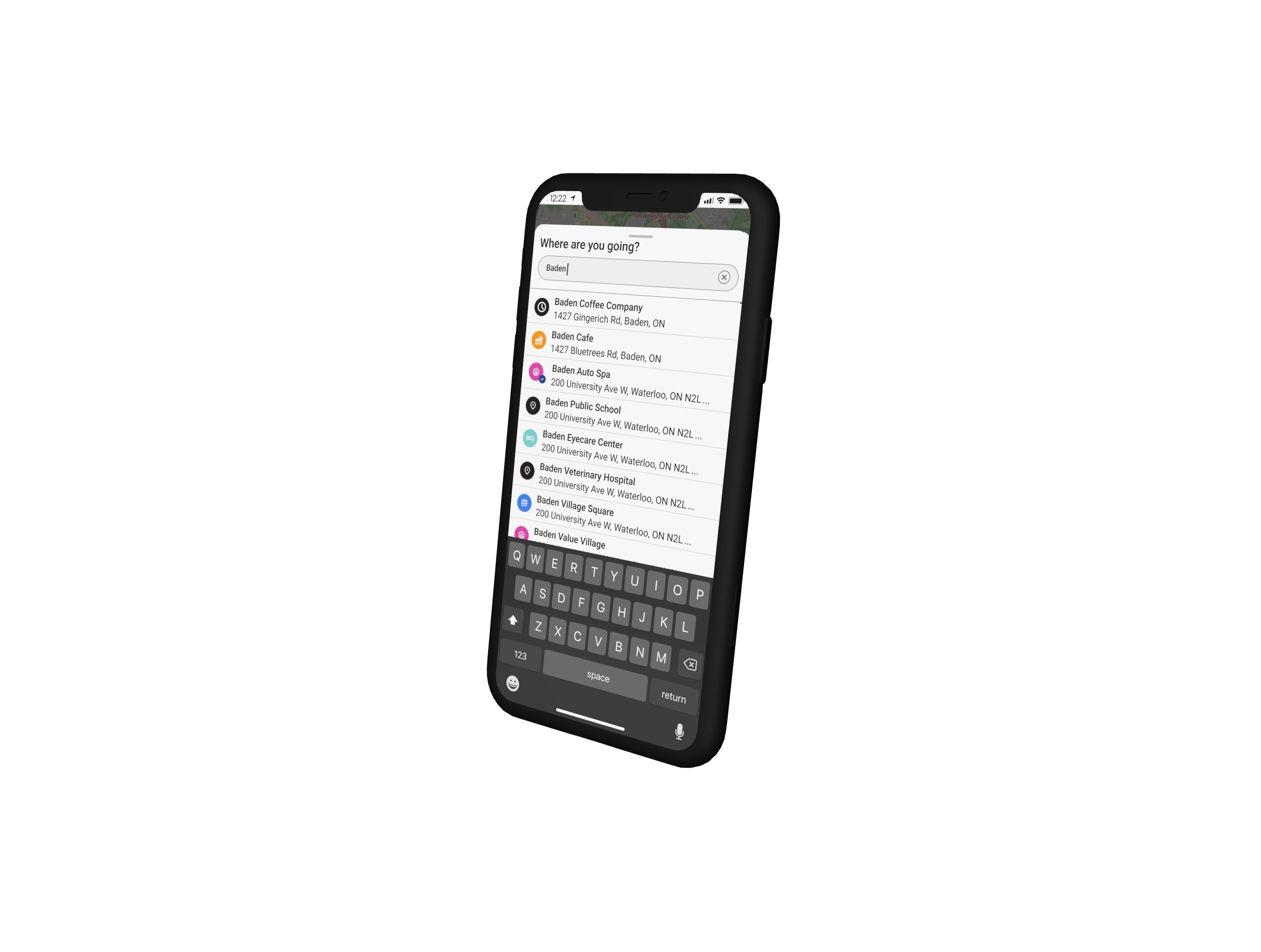
Solution #1: Presenting Search Results
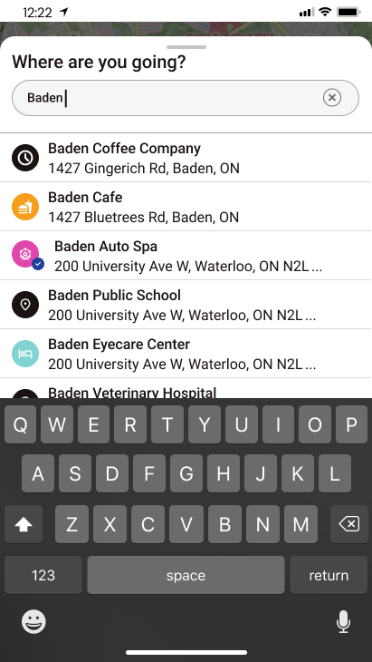
The relevant search results must reflect what users input into the search field and consider the user’s proximity. Since the app was only available to use in the Waterloo Region, my team ensured that search results only provided geocoding matches within the region and in the proximity of users’ locations.
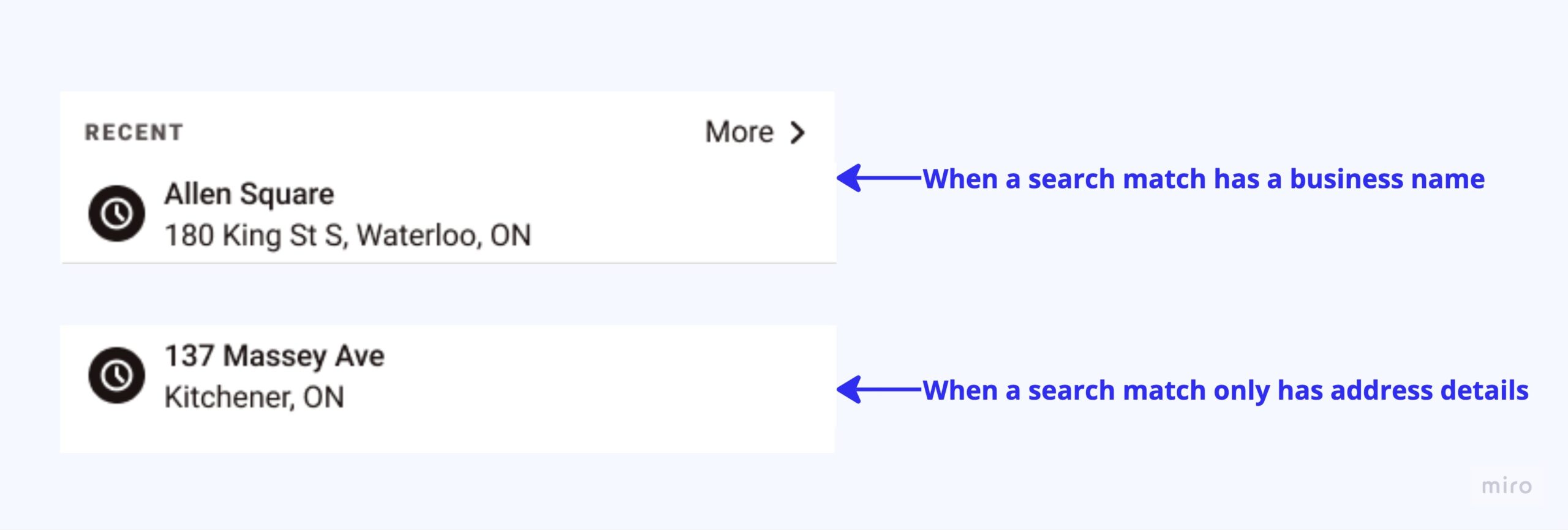
The goal of designing the search result item was to present location details in a way that’s quick to understand. I accomplished this by differentiating the format of a titled location vs a street address.
I used icons to distinguish recent search results from matches. In testing, users easily found locations when partially inputting details in the search bar.
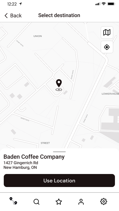
Solution #2: Select a point on the map
To search for a place, a commuting cyclist would either know the name of a place or address details. But what if a location doesn’t have specified information, like a specific area of a park or a particular area of a transit terminal? To remedy this issue, I designed a functionality where a user can point to a target on the map and define that target as a destination to find and travel to.
Handoff for Development
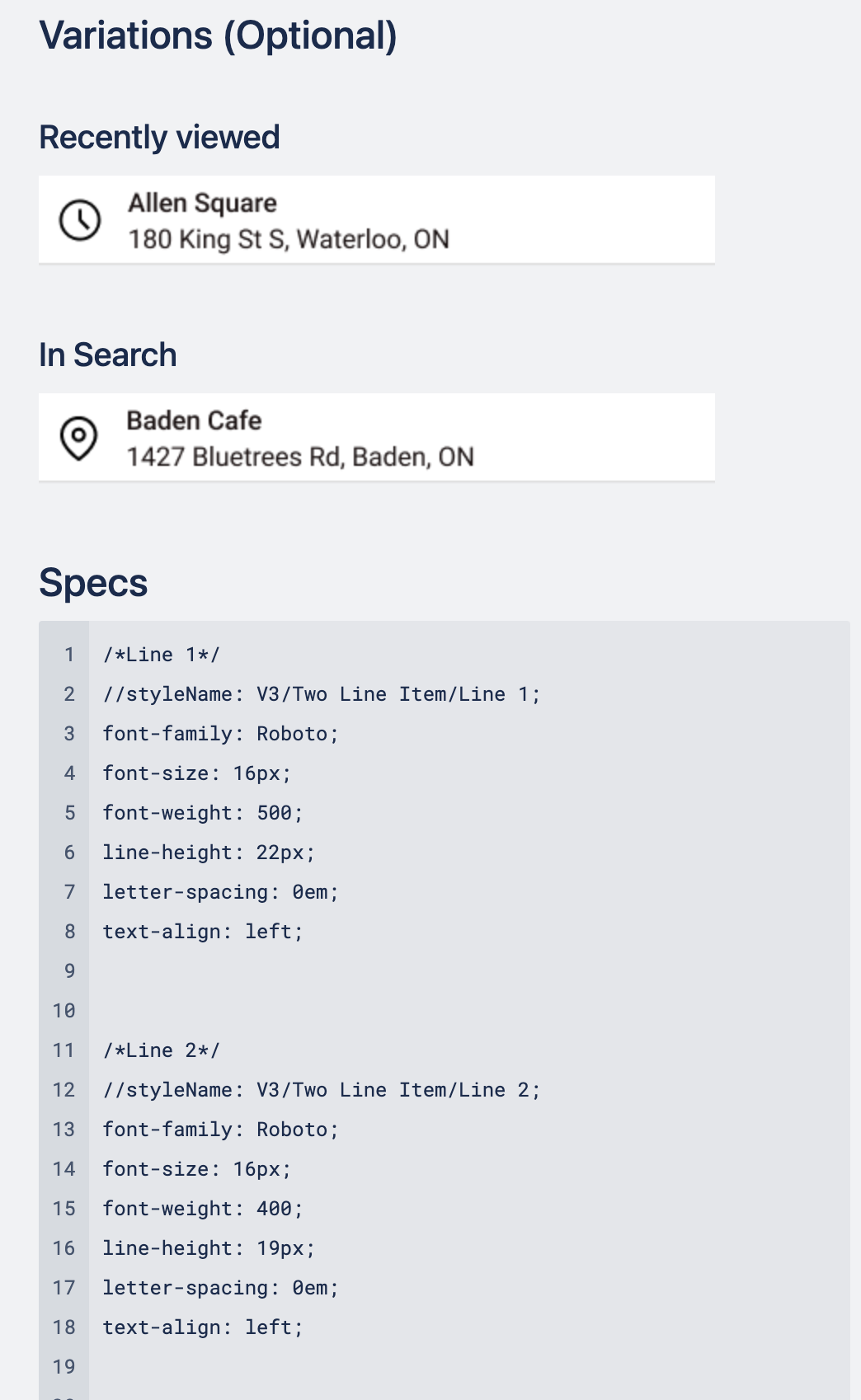
When I was at Zeitspace, as a part of my handoff packaging, I would write user stories related to the feature or epic that document details of the feature, acceptance criteria, and annotations of the screen.
Sample of Documentation for Design System
What I’ve Learned
This assignment was done during the early development of the Cycling Guide, so I didn’t have an existing project to understand what needed to be revamped. Working on a project in its early phase like this, I developed the skill of narrowing in and focusing on simple workflows like searching for a place. I was attentive to understanding information needed for new users vs recurring users, formatting data, and considering environments some users may be in when looking for a place.
