Company
Baselane
Project Overview
Baselane is a finance company tailored to landlords and real estate investors. Baselane’s banking platforms allow their end users to create multiple “virtual” accounts from their Baselane account to set aside money for different purposes. Landlords and real estate investors can earn up to 5% cash back on expenses when their Baselane accounts are used.
This project was part of a design challenge for a position at the company. The challenge was to redesign their dashboard page.
Project Type
Conceptual Design, Dashboard Design
Role
Product Designer
Skills Demonstrated
UX Strategy, Visual Communication, Information Architecture
Challenges
Since this was a design challenge, the design brief detailed the Redesigned screen must have the following:
- Provide intuitive navigation across different accounts (main accounts & virtual accounts) so users can organize their money
- Illustrate an overview of balance, income, and expenses across accounts
- Allow users to track transactions across accounts
- Highlight cash back income on Baselane accounts
Outcome
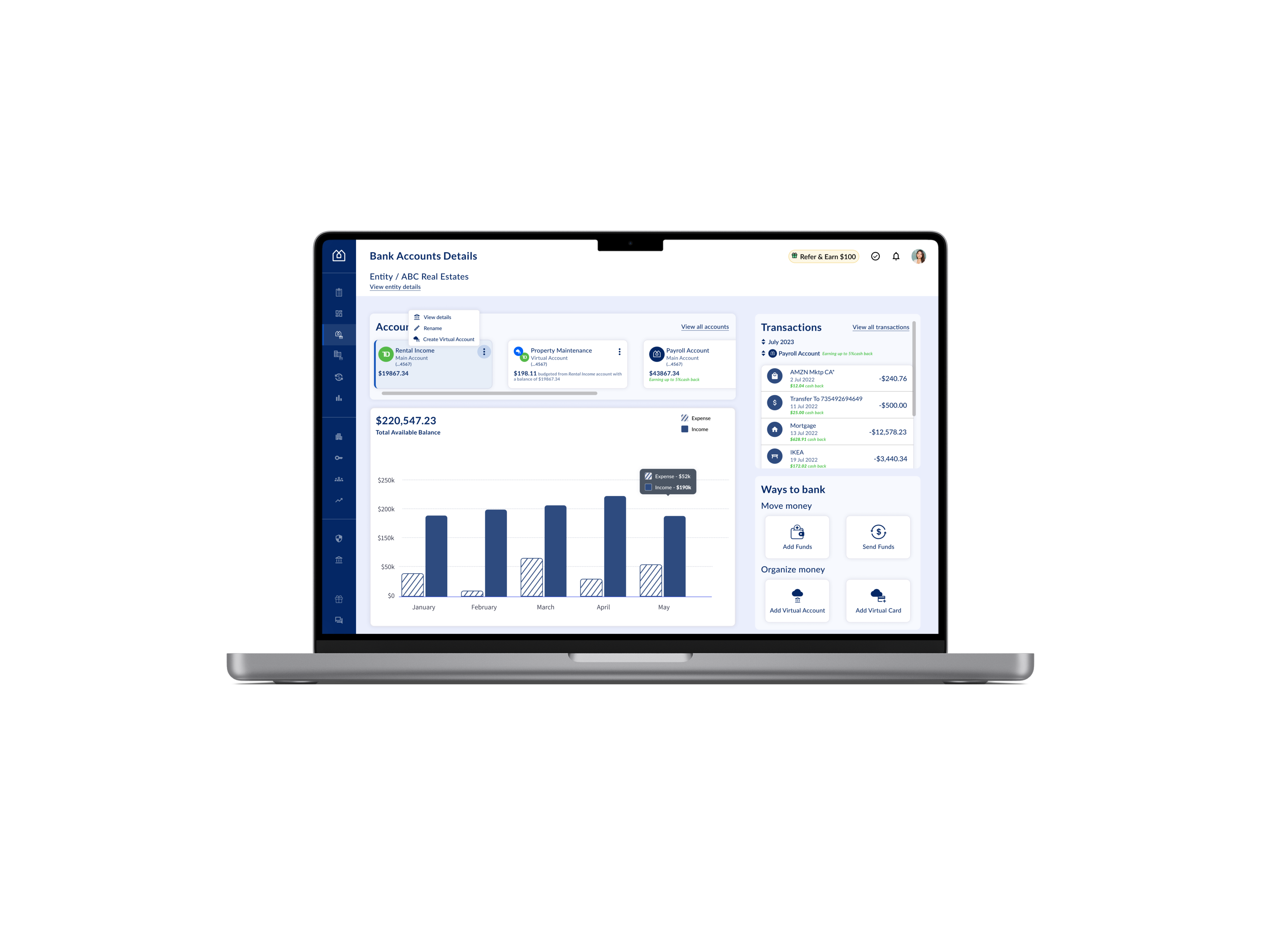
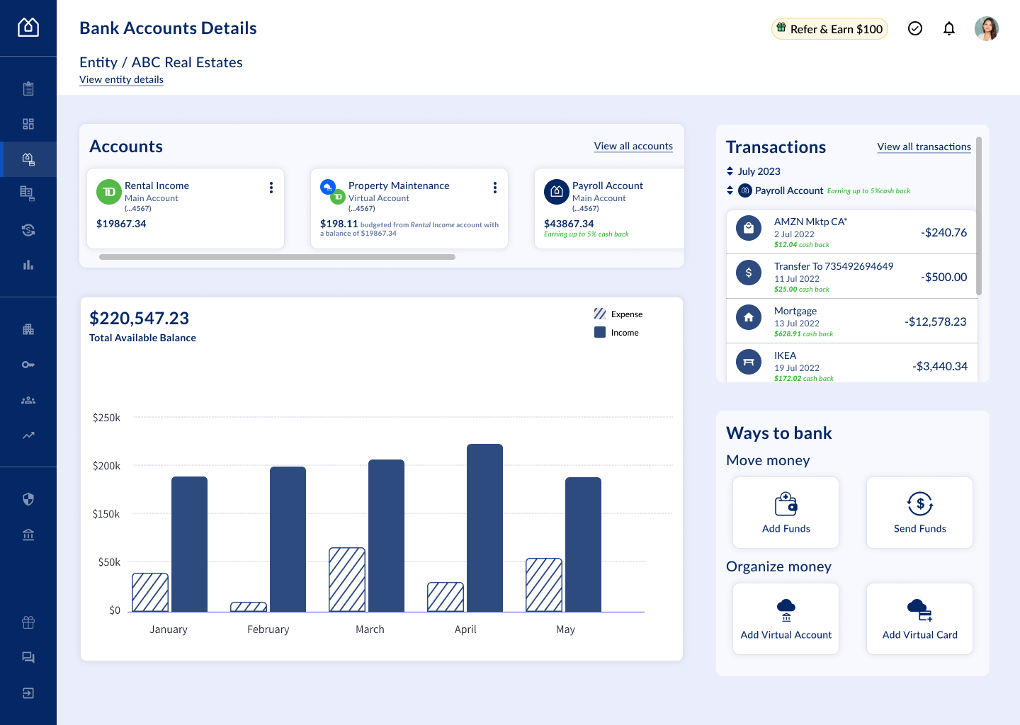
I redesigned their dashboard screen, focusing on improving specific components that were providing high value to landlords and real estate investors to support their financial decision-making.
High Fidelity Mockups – Desktop View
Process
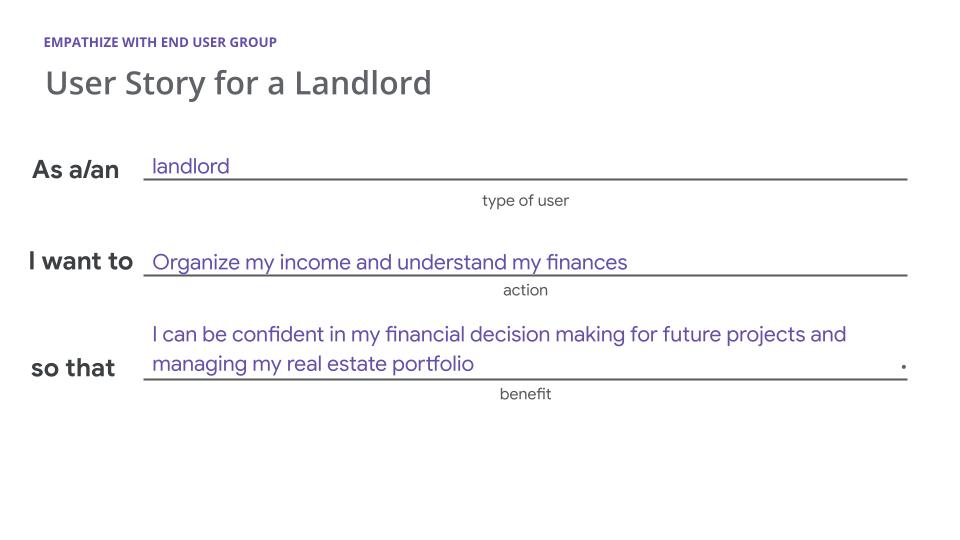
Empathize with end user group
When working on design challenges, keeping your end-user group at the forefront when ideating is essential. One method to do that is to create a user story. User stories are a valuable tool for understanding this user group’s goals.
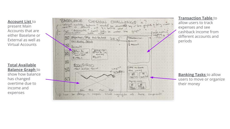
Sketching to understand
When reviewing the assigned screen I had to redesign, I began sketching to understand how to improve the layout. While sketching, I was able to understand what the high-value design components are and how I can make them more useful to landlords and real estate investors.
Design Improvements for High-Value Components
Account Card
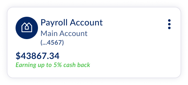
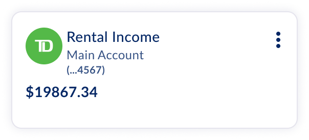
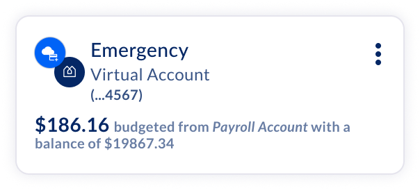
In designing the Account Card component, I knew that there needed to be classes and variants for:
Main Accounts
Virtual Account
Before

After

In this redesign, you can tell which accounts are Main Accounts vs Virtual Accounts. Main Accounts have one logo, Virtual Accounts have a conjoined logo. The Budget balance information is presented differently in which Main Accounts will display the whole balance value, and Virtual Accounts will show the partial information displayed. Since Baselane Accounts and other Financial Institutions Accounts are classified as Main Accounts, using the institution logo helped users understand what accounts are on the platform.
Total Available Balance Graph
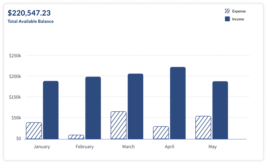
In the redesign, I wanted to visualize the account balance data showing landlords and real estate investors how monthly transactions impact their total available balance. A Stacked Bar Graph effectively shows more details of the balance by seeing the amount of expenses and income from month to month.
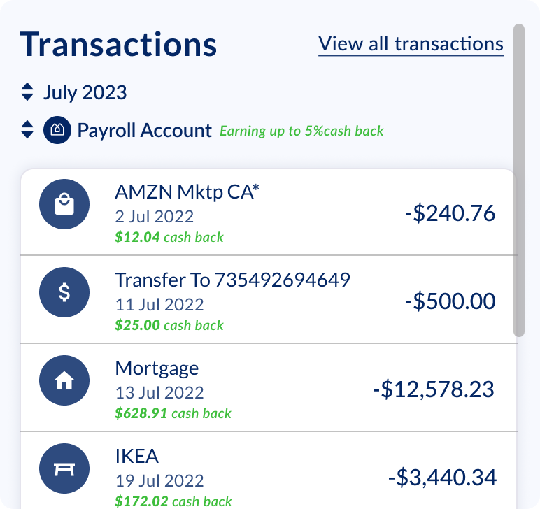
Transaction Table
To encourage landlords to use Baselane as their primary account, this Transaction Table will present cash back income for when the landlord decides to view their Baselane account transactions.
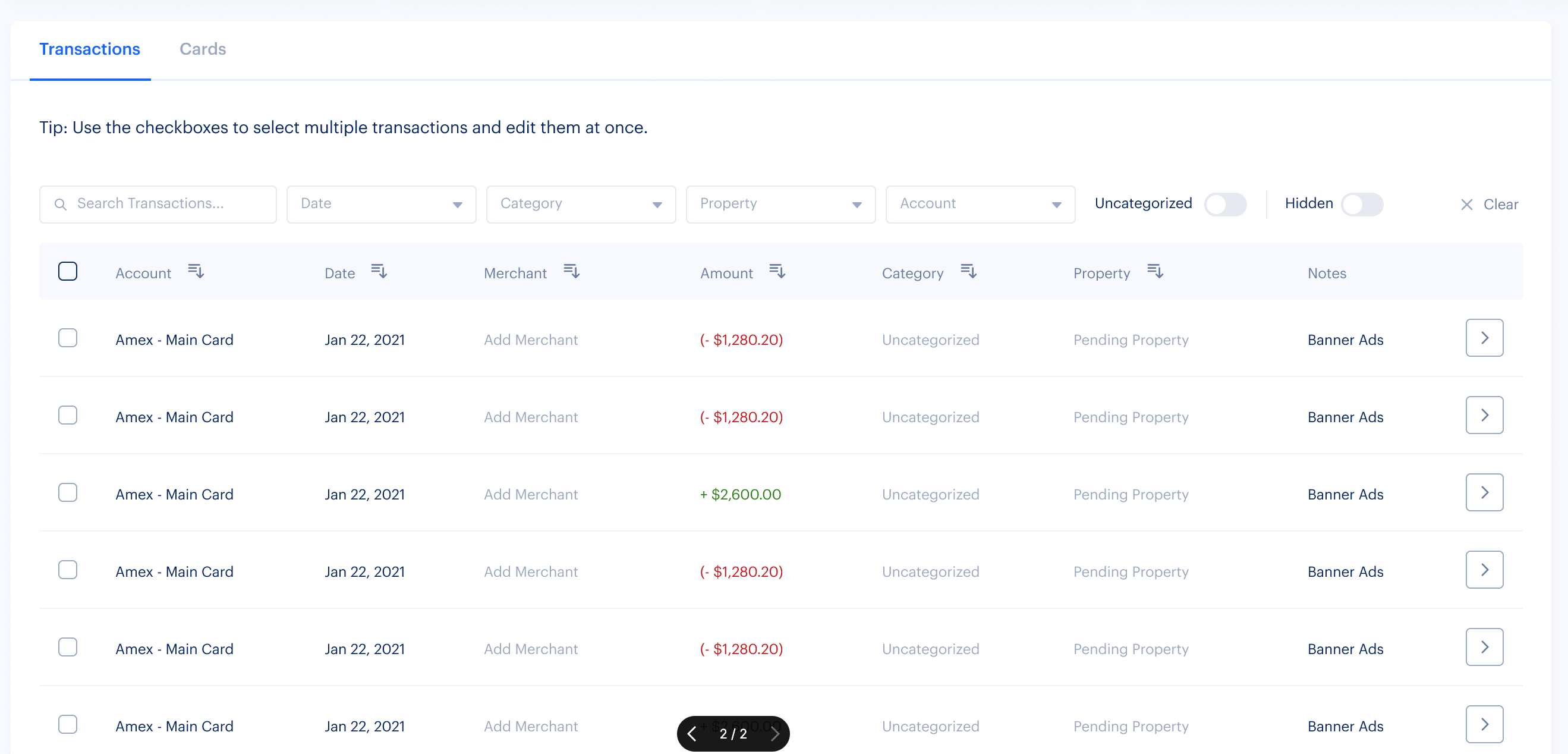
Before
In the original table, some columns were empty, and it was taking up a lot of space.
After
Ways to Bank Panel
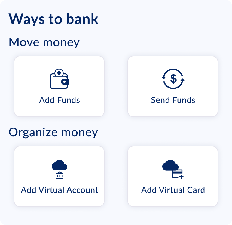
To improve how landlords conduct banking tasks, I reorganized the grouping and placement of the buttons using Gestalt Principles in mind. Gestalt Principles are laws in Human Computer Design that describe how people group similar elements and recognize patterns when interpreting information. This is an important best practice because we want these buttons to be intuitive and predictable for users when interacting on the platform.
Before
The buttons only had text. and primary and secondary styles were used across all four of the buttons, which was usual. Also, having all buttons in one group made the buttons harder to comprehend and differentiate.
After
Including icons in these buttons helped improve the visual language. Grouping the buttons by related action themes (Moving Money vs Organizing Money) would help funnel the decision-making process of how a landlord or a real estate investor wants to move or organize their money.
Handoff for Development
In a handoff package, I would annotate the purpose of each element and where it is being sourced from.
What I’ve Learned
Having a basic understanding of relational databases was useful for me in this challenge because I was able to design the Account Card component with information from the Virtual Account database table, which is dependent on the Main Account database table to show a meaningful relationship between the Virtual and Main accounts.
