Personal Project Overview
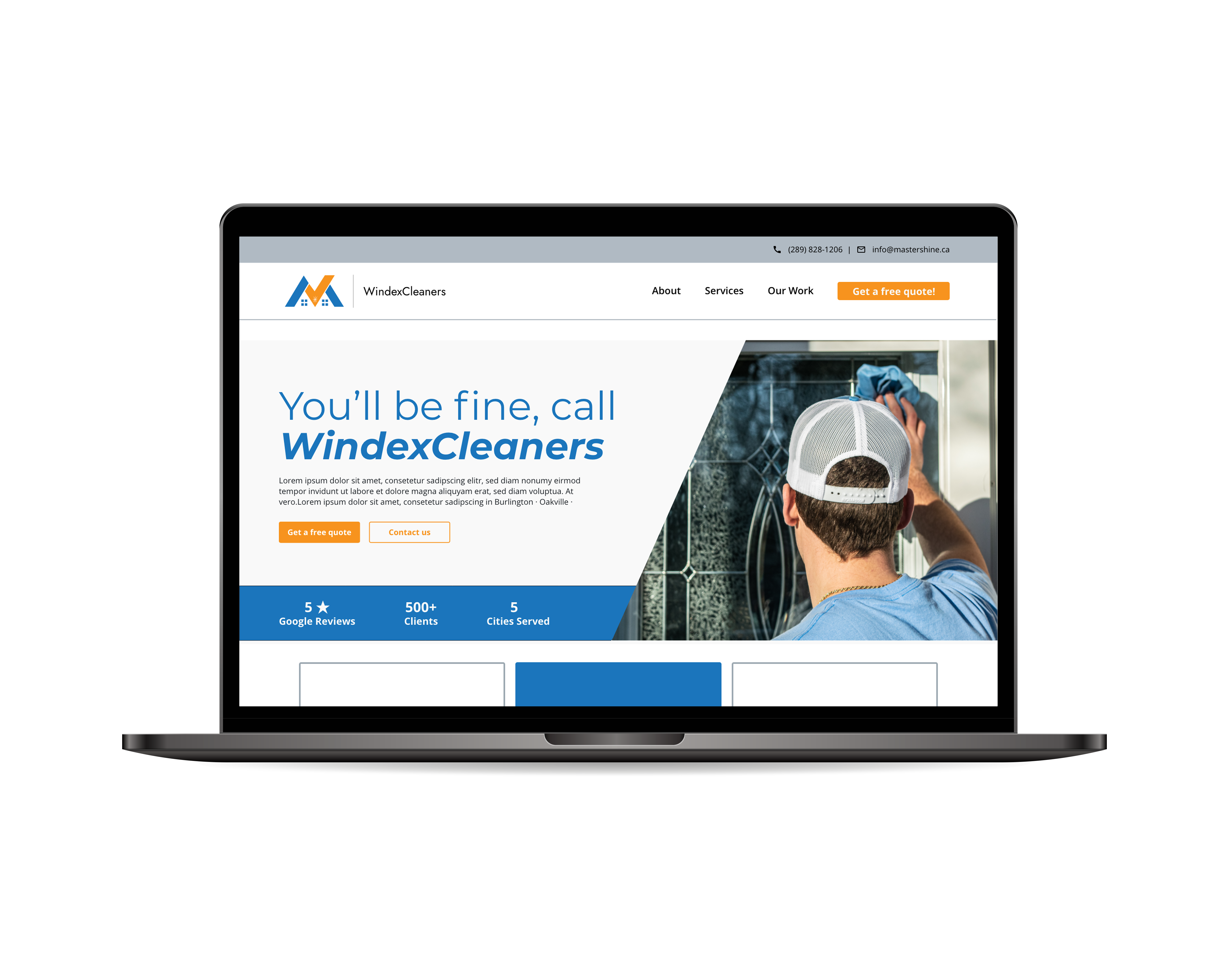
Windexcleaners is an exterior cleaning service that university students run. They have a growing clientele with residential and commercial customers. The client wanted to redesign their website to better position their services and transform their reputation. With their clientele mainly consisting of people that are elderly, they needed to be able to submit quotes online easily. Although it wasn’t an issue before the website redesign, it was an opportunity to improve their form on their quote web page.
Project Type
Website Redesign & Form User Flow
Role
UX Designer
Skills Demonstrated
UX Strategy, User Empathy, & Customer Journey Mapping
Planning
Enforcing the visual brand
Since the business owner was transitioning from branding themselves as “student cleaners” to “cleaning professional.” It was important that I maintained their visual brand but enforce that the students in the business are proficient in their work and their process is “business-like.” In how I will convey the brand’s attitude to users, I researched colour psychology to help me ideate a colour scheme.

With their main colours being orange and blue, I added neutral greys in the colour palette. When using these colours, I followed the 60-30-10 rule where the greys were the dominant colours, blue was the secondary colour, and orange was the accent colour. In using more blue and less orange throughout the website, the feedback from their past clients recognized the brand attitude they wanted to achieve, which was “professional,” “trustworthy,” and “safe.”
Sitemap
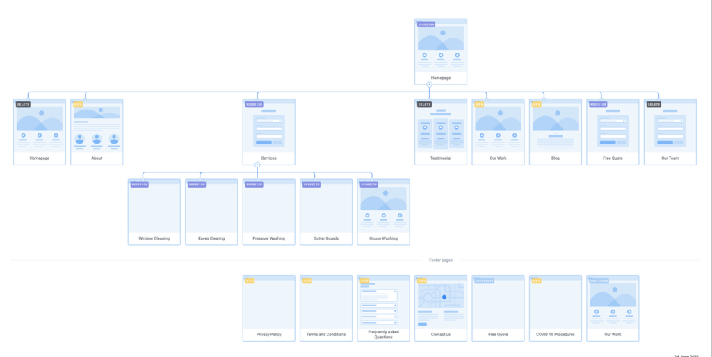
After reviewing Mastershine’s current sitemap, I created an improved version taking notes of which pages can be merged, omitted and added. Showcasing this to the business owner helped them understand the website’s structure, and the user flows.
Low fidelity mockups
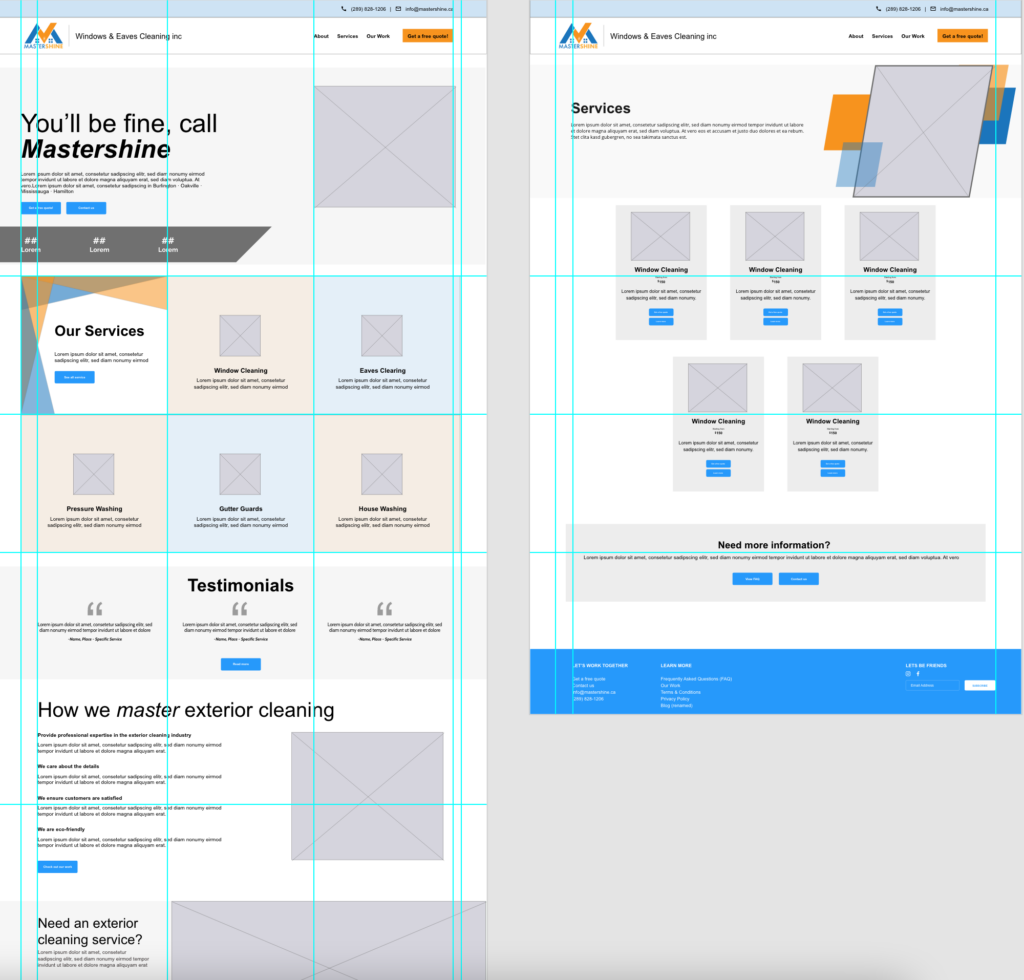
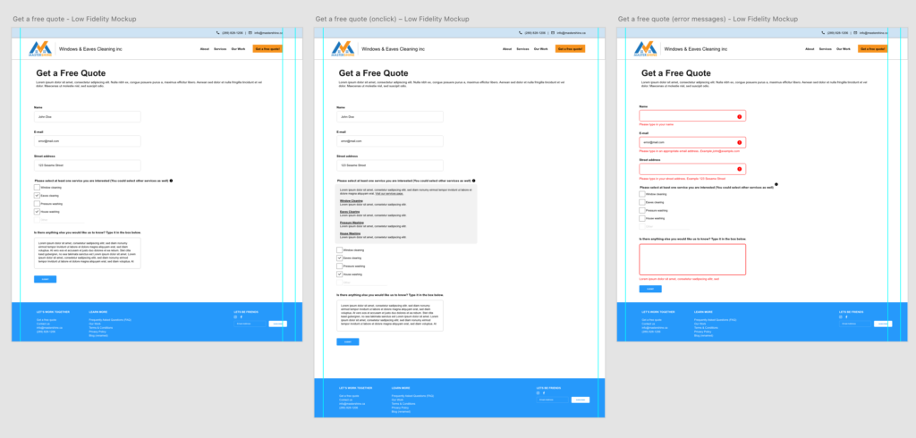
Low fidelity mockups were created to represent the early design and content of primary and secondary web pages. It focused on the layout and structure of the web pages.
As the focus of the website was ensuring that the “Get a free quote” web page was user friendly as possible, I research user experience best practices on creating form pages.
Strategizing an effect quote page
- Understanding “interaction cost” — The sum of efforts — mental and physical — that the users must deploy in interaction with a site in order to reach their goals
- Ask the right questions in where data is relevant to clients but easy to collect from users
- Error messages should be visually explicit and provide constructive advice
High fidelity mockup of key landing pages
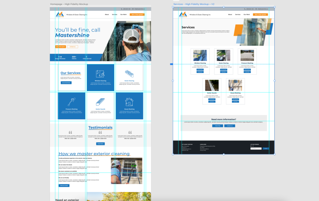
The “Get a Free Quote” web page was one of the important pages of the website for Windexcleaners since it is one of the phases in the customer’s decision process in deciding to work with their company.
1. Asking the right questions
Since the page’s purpose was to collect information for the business owner to determine a quote, the right questions needed to be asked or properly formatted. During the stakeholder interview, I worked with the business owner to figure out which key questions needed to be answered, what questions can be optional, fixated, or open-ended. In knowing the possibilities of how the questions can be answered, I adapted them in the relevant input fields such as form fields, checkbox radio buttons, and text areas.
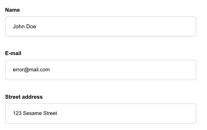
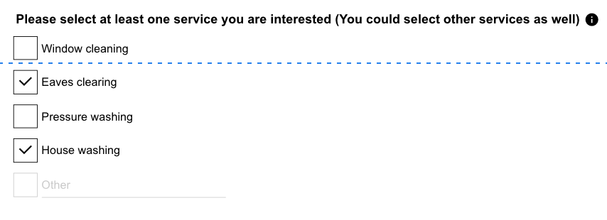
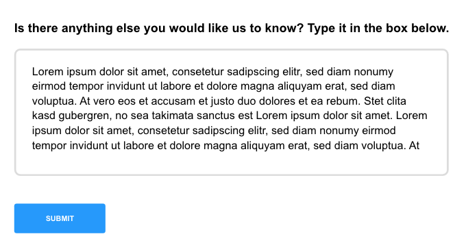
With keeping that in mind, I was able to balance the need from the business owner, which was collecting information to help calculate a quote and the need of elderly users, which was the support needed to fill out a form independently. For the business owners, I was efficient in framing the correct questing and formatting the input field. At the same time, for the elderly users, the error messages were helpful enough to fill out the form page correctly.
2. Providing extra details
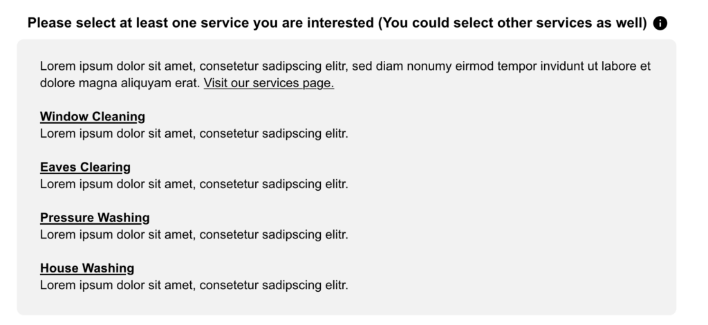
The one question that I pointed out to have possible confusion was, “Please select at least one service you are interested in.” Although the service options are listed as checkboxes below, users may forget the exact details of what which service means. Therefore, I included an info-based button toggle to drop down a summary of what each service is.
3. Providing advice in error messages
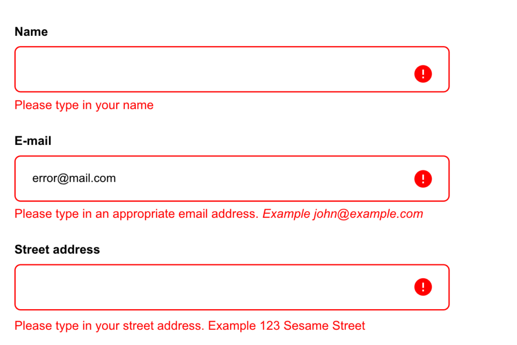
As with all other forms, it is known that when an error occurs, there should be visual feedback highlighting the mistakes. I ensured that this was followed, and other best practices such as making sure that error messages were in-line with the relevant questions and the error copy details provided advice on how to resolve the error.
4. Providing feedback that the form was successful
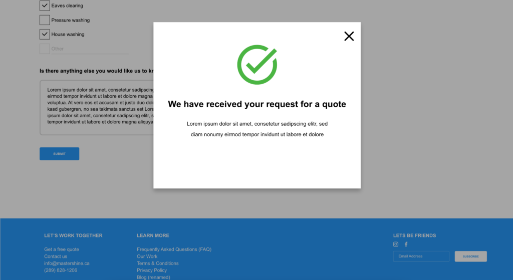
To make it clear that the form submission was successful, I opted to use a modal box than a simple text-based success message to make it clear for users that their submission was received. With keeping in mind that Windexcleaners’ key market is the elderly, it was possible that the temporary text-based success message may not stand out enough to them. However, the modal box captivates attention, and since it requires users to exit the pop-up manually, it provokes effort to understand the success message.
Feedback
Since the client understood the importance of user experience, mainly due to his clientele consisting of most of the elderly, he would bring the high-fidelity mockups of the “get a free quote” web page for critique to his close client’s feedback. From their feedback, they understood the advice of the error messages and functionality of the input fields and label buttons. Usability tests could’ve provided much more value, but since this project was done in 12 days, it was out of scope at that point.
Conclusion
This project was the first time I took into consideration of user interactivity for form-based web pages. The preliminary research I did to learn more about the best practices of user experience in form-based web pages enlightened me about why users abandon websites that depend on users’ participation. This awareness made sense when I read Nielson Norman’s explanation of “interaction cost,” which stuck with me when designing the “get a free quote” form page. With keeping that in mind, I was able to balance the need from the business owner and the need of elderly users. In the final iteration, the design showed efficiency in collecting the needed information that can be done correctly with minimal confusion or extra support.
